


Color of the Year: Pantone’s Viva Magenta
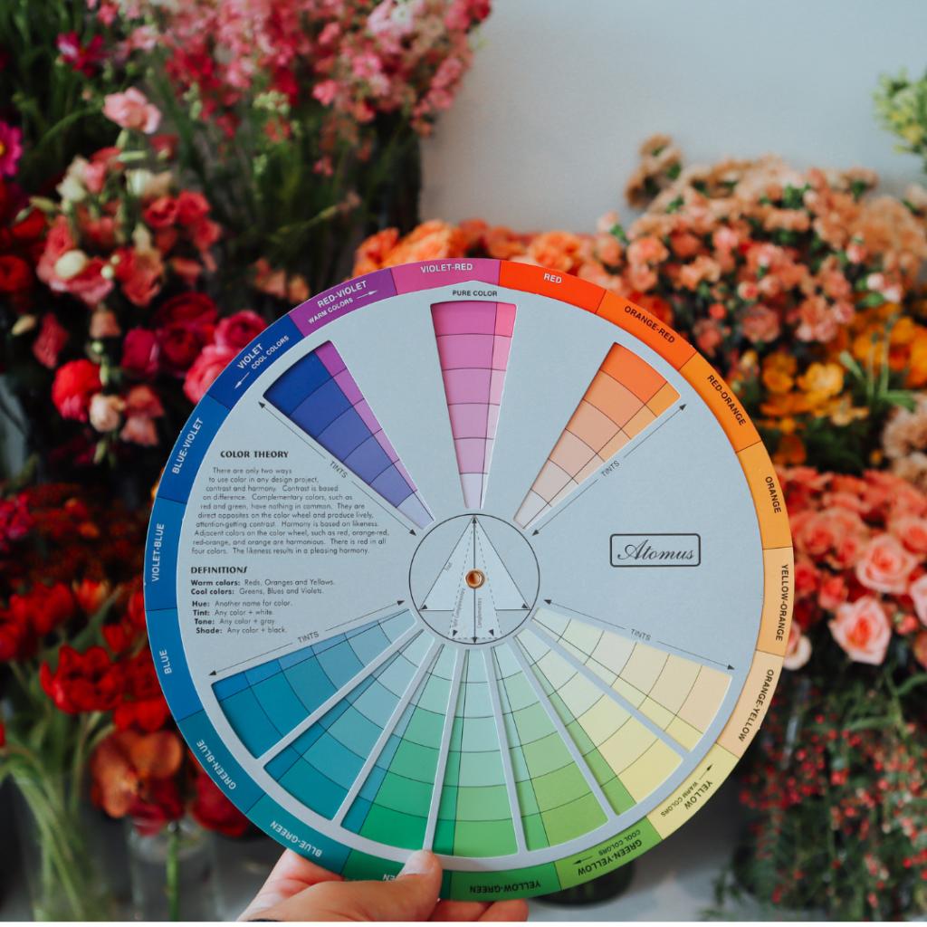
Color is one of the first elements we notice in a floral design, and is a favorite topic of mine to discuss and teach. It can be intimidating and complex, so I feel passionate about taking it back to the fundamentals to establish some color confidence 😉 A good grasp of color theory is one of the core skills that can take your floral design, so today I want to get into it!
Pantone is the gold standard for color professionals. Their color-matching system helps designers from floral, to graphic, to interior, to fashion design (and more) communicate and collaborate through different mediums (print, digital, etc.). Essentially, color is a difficult thing to replicate across mediums, and Pantone has helped us get as close to consistent as possible.
For instance, think about blush and how a client may interpret it. They may think it is an off-white or maybe a baby pink, or more of a sandy shade. Pantone can be a great reference tool for getting on the same page when we talk about color.
Pantone also selects a Color of the Year that forecasts the culture, trends, conversation, and tone of our times. It’s a very cool concept; that a color in itself can match the feeling of our year. If you want to learn more about how they choose the color and what influences the decision, check out this link.
So, Pantone’s color for 2023 is Viva Magenta. According to Pantone, this color:
“vibrates with vim and vigor. It is a shade rooted in nature descending from the red family and expressive of a new signal of strength. Viva Magenta is brave and fearless, and a pulsating color whose exuberance promotes a joyous and optimistic celebration, writing a new narrative.”
When I break down what Viva Magenta is, I see a “core hue” of red, with a lavender/pink undertone which makes it a cool-toned red. It has energy, power, and passion and evokes excitement and intensity.
Generally speaking, the color of the year is a guideline, not a rule. Pantone selects a color that is representative of the whole world, and will impart itself on all industries, so it might not feel super relevant to floral design itself. If you’re excited about this color, wonderful! If you’re not, that’s ok! But it’s good to know what trends may be impacting our work.
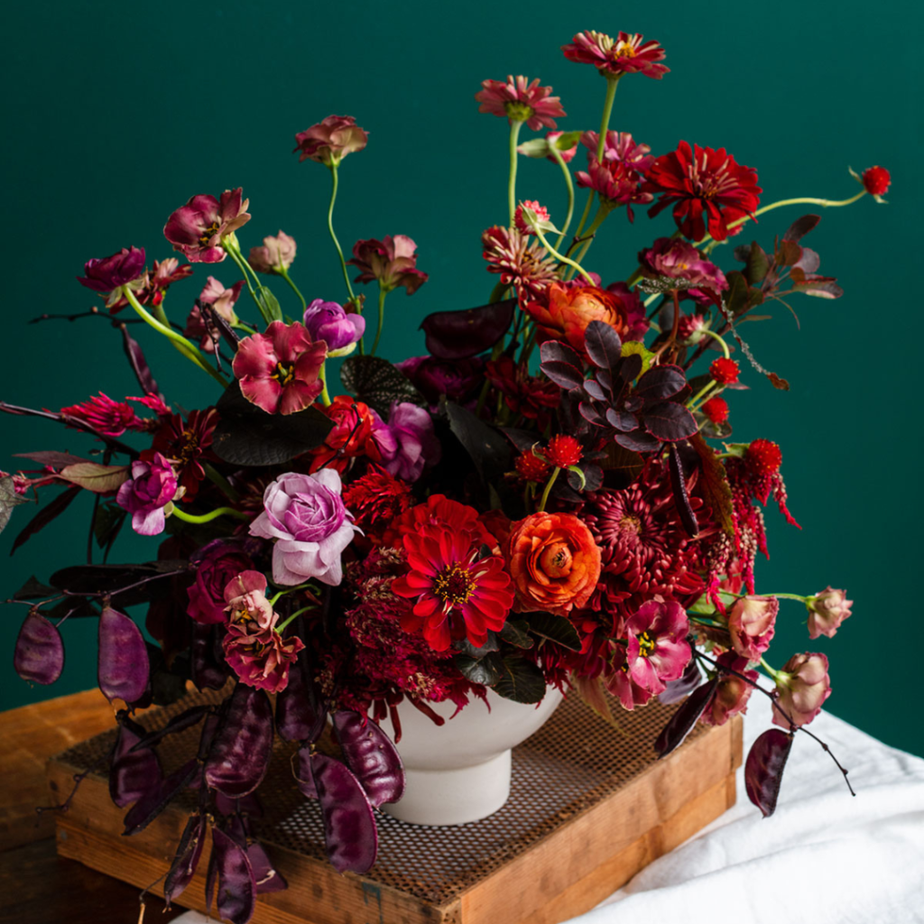
So let’s talk about using Viva Magenta in floral design! As a warm red, this color can dominate in designs, and so we’ll need to be intentional in how we work with it. It’s bold, intense, and saturated and it can be challenging to work into more traditional designs, formal wedding work, or sympathy pieces.
In order to make this challenging shade look elevated and not overly bold, here are a few tips:
Pair With Green
Red’s natural complement is green. You’ll see it so often in nature: foliage that blends from chartreuse to red as winter approaches, tropical blooms with red veins and pink undertones, eucalyptus foliage with burgundy, new-growth tips, flowers with red lips and centers, and grasses that end in a copper-red seed. It’s everywhere!
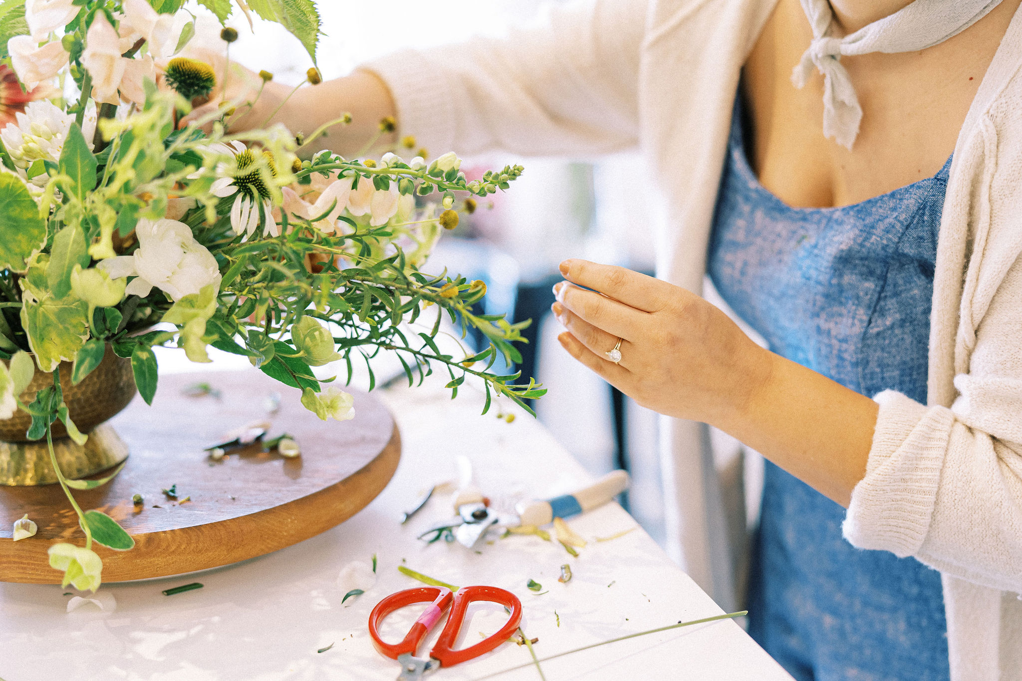
Don’t underestimate the value appropriate foliage can bring to a design (check out my video on this here!). Use foliage to complement and blend magenta-reds into palettes. It’s a seamless combination.
This same concept applies to flowers as well. If you’re struggling to connect magenta shades to other blooms, try flowers that carry both green and red tones at the same time. This occurs a lot in fruits, too, so reach for gorgeous gala apples, pomegranate, and turning berries as a great way to bring out magenta-red as an accent.
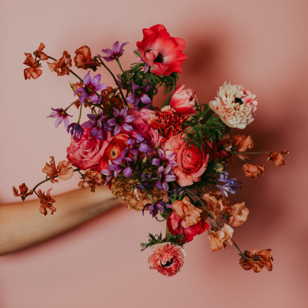
Use as an Accent in a Tonal Palette
Since this color is so strong, a little goes a long way. You can change its impact by making it proportionally minimal.
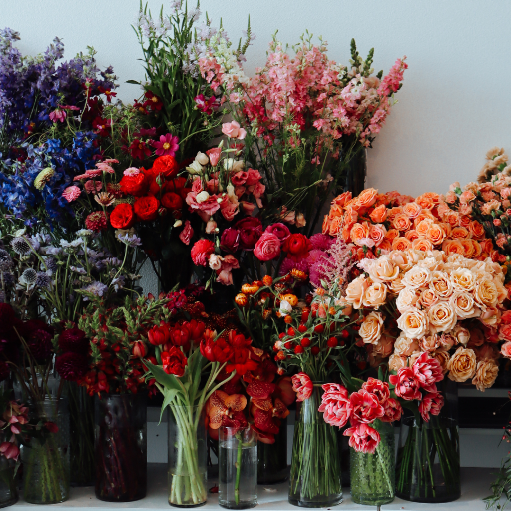
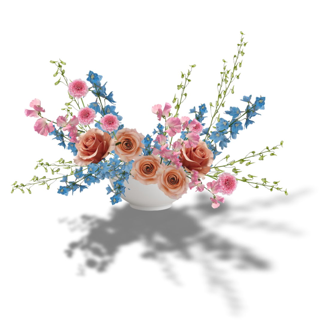
Take this bouquet:
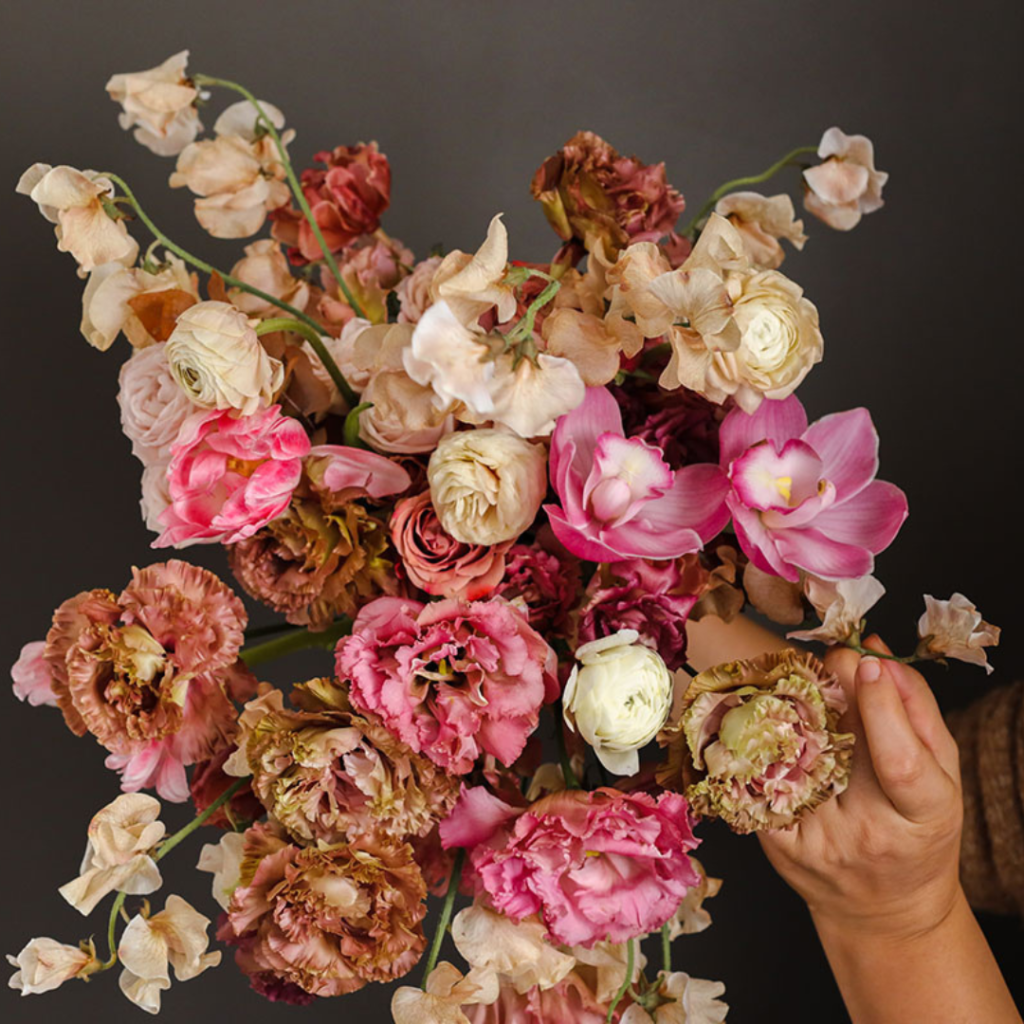
Notice that this palette is, in essence, blush and beige. AKA, the most popular wedding colors of the last few years. By bridging blush to hot pink with brown-pink lisianthus, and by using a pop of magenta-lipped cymbidium and pink lisianthus, this palette has been transformed into something rich and energetic without sacrificing its elegance.
Reach for beige, blush, and brown shades with tints of red and hot pink to make a seamless transition from soft shades to popping magenta.
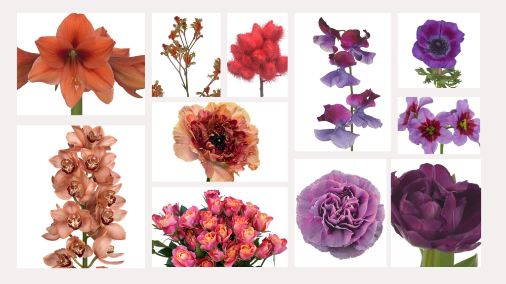
Get Analogous With It
Analogous palettes have a lovely harmony, and Viva Magenta looks stunning with orange and purple shades. It’s hot, playful, and vibrant. It looks really natural in summer and autumn. The only problem: the contrast can be too strong or not the right fit for a venue or client taste.
This is when your design and color theory really connect! Keep this look elevated by creating an asymmetrical design or airy bouquet. Consider going with minimal to no foliage, since this palette already has three competing, strong hues.
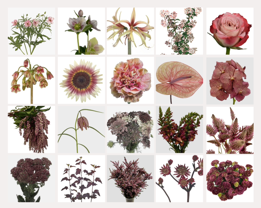
Viva Magenta
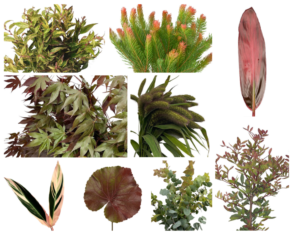
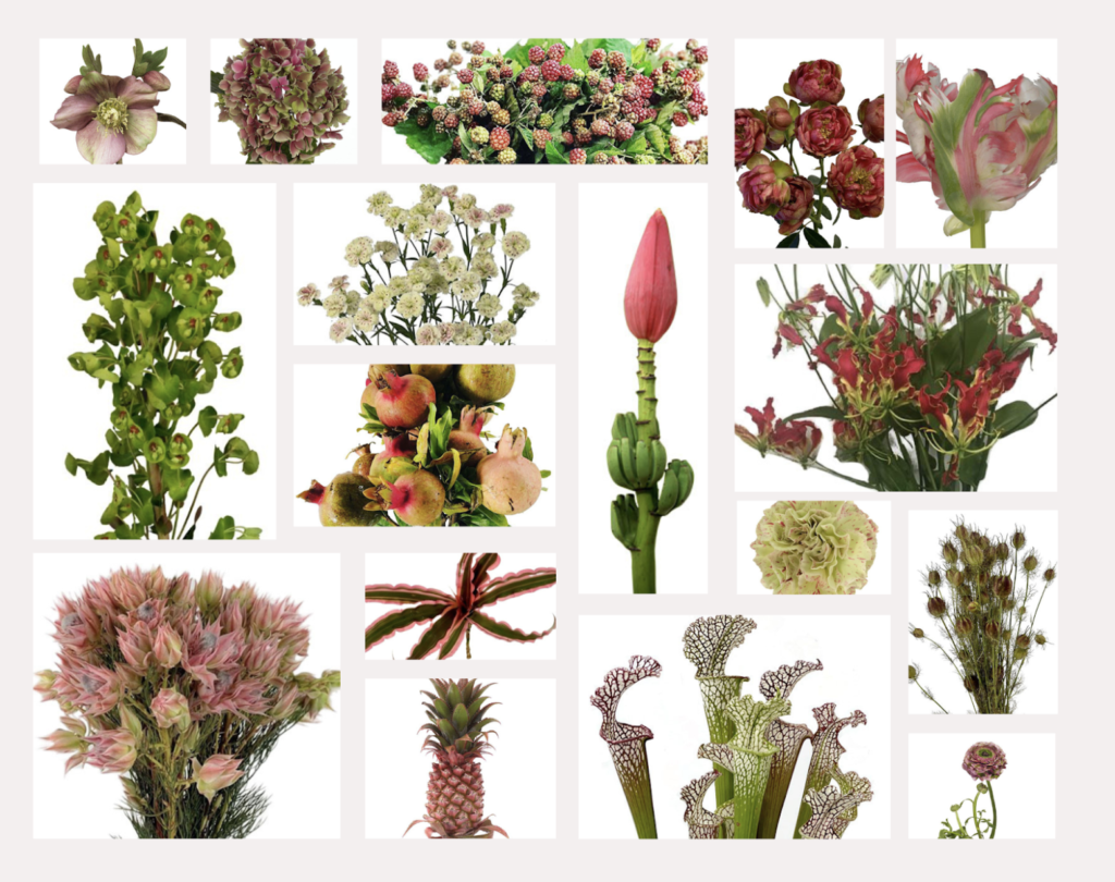
It’s important to note that Viva Magenta has A LOT of red in it, like a muted cranberry or a light burgundy and it can be challenging to find just the right shade so using multiple tints, tones, and shades of magenta and red can be incredibly useful in bridging and blending.
Below is a mix of red, red-magenta, and magenta shades to encompass the feeling of “Viva Magenta”. You’ll also find that these red-magenta shades are particularly difficult to photograph, so incorporating multiple versions of these hues will help you create contrast so arrangements read better in photos.
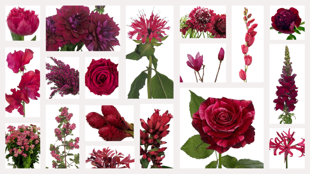
There is no shortage of beautiful flowers in this color and so if you are struggling to find some inspiration, look no further than the Mayesh Flower Library which sorts flowers BY COLOR! Sort by red, burgundy, pink, and even brown to find loads of Viva Magenta inspiration.
I hope this deep dive has inspired you to not be intimidated by incorporating reds into your work and to give Viva Magenta a go!

Leave a Reply
I think you'll also love reading...


Thank you please keep sending me information I greatly appreciate your knowledge.
Thank you for all the wonderful suggestions and photographs!
Glad it was helpful Debra!