


Hello, Yellow: How to Elevate Floral Palettes with the Power of Yellow
Pastels are supposedly the “colors of spring,” right? Except when you look around, many blooms available in this current season are sometimes eye-shutteringly vibrant: the iconic tulip fields of Holland are flush with reds, purples, and hot pinks. Hyacinth blooms into a saturated violet. Forsythia’s bushes seem to scream spring’s arrival from the interstate median…in the best way of course 🙂
So when it comes to designing for spring, it can be a challenge to channel all those bright colors into something that feels right for the season, elegant, interesting, and cohesive.
Today we’re going to talk about one of the more dominant spring colors that can trip up a lot of florists, and unpack just how to use it to help you elevate your palettes: YELLOW! 💛
Daffodils, forsythia, tulips, and mimosa, are easily some of the most abundant and iconic spring blooms and they are yellllowwww, like a highlighter! This neon yellow vibrancy can cause some real trouble in a palette, OR (if done right) can bring excitement and vibrancy.
It’s a critical part of our job as floral pro’s to work with these color challenges. While this blog post will contain lots of useful tips, you may want to check out my complete course, Color Theory Confidence, for a thorough training on everything from the properties of color, color harmonies, color and its relation to other principles of design, and my Palette Building Process to help you level up your color palettes before busy season really kicks in!
Let’s get into it!
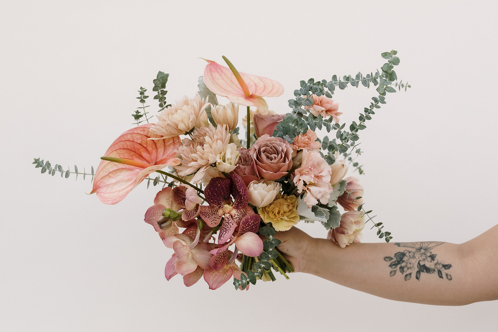
- SOFTEN IT
There’s a reason yellow is used for caution tape and warning signs, it’s high visibility makes it stand out.
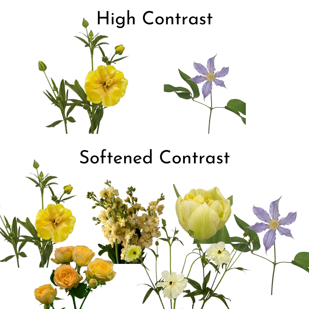
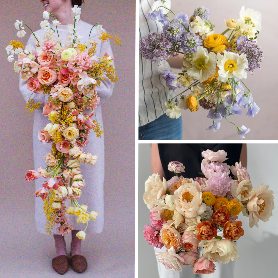
One way to approach vibrant yellow is by blending it with tints of the same hue. Incorporate butter yellows and creams to reduce the high contrast in your palette and “soften” the dominance of that bright yellow vibrancy.
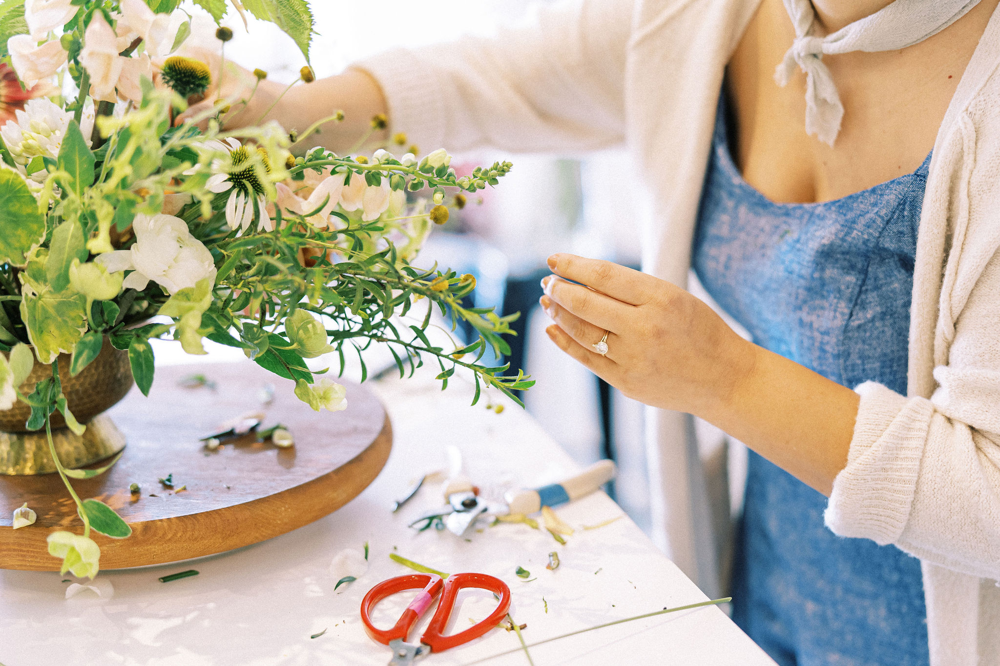
I utilized this technique for this complementary, spring-time palette for a Bouquet Bootcamp® workshop. Together, lilac and lavender sweet pea can look out of place with bright yellows. But utilizing soft shades found in stock, tulips, “Caramel Antike” roses, and even blooms with yellow centers, like clematis, we are able to blend this contrast and create something elegant but still dynamic.
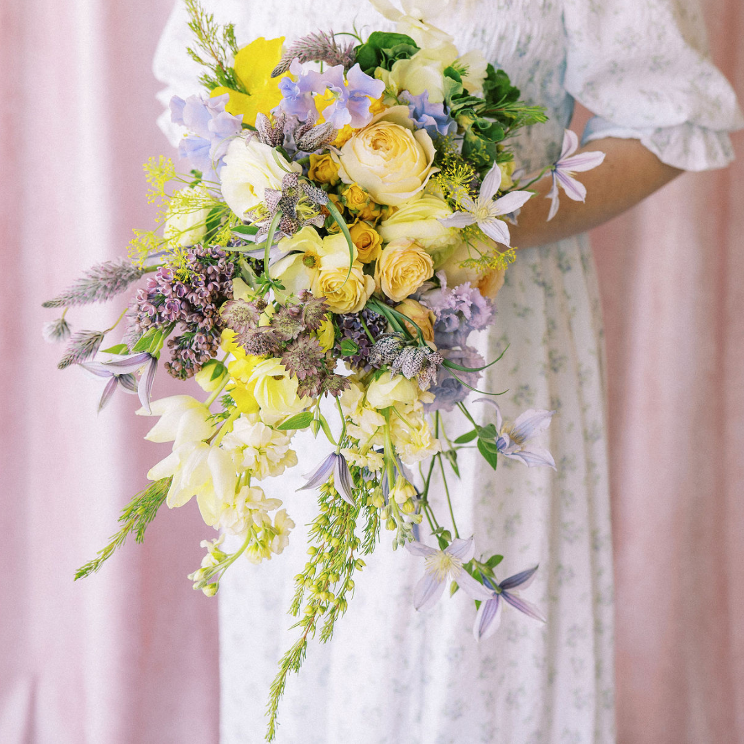
Photo by Kate Panza Photography
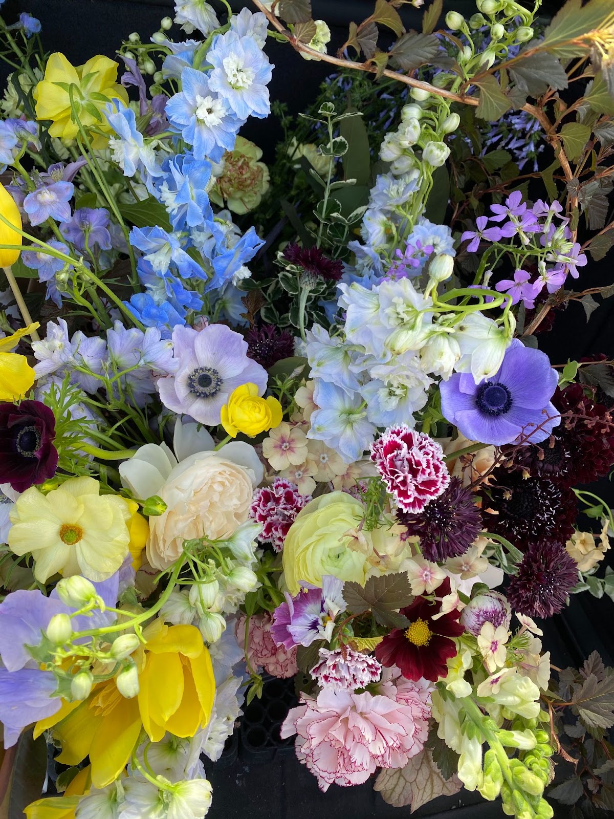
Here are additional examples of using this same technique:
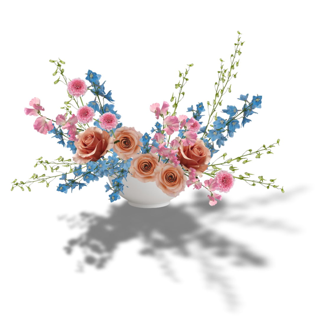
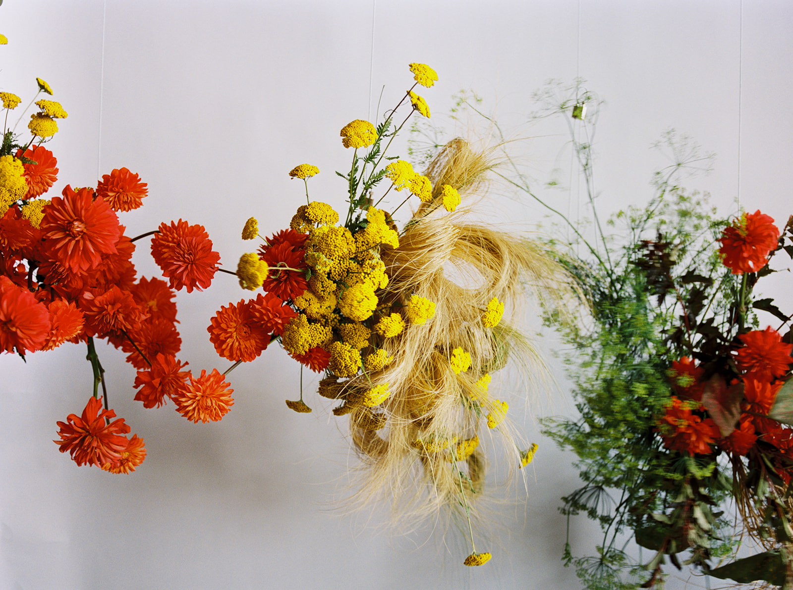
- USE AN ANALOGOUS OR MONOCHROMATIC COLOR HARMONY
Monochromatic and analogous color harmonies are a wonderful way to work with vibrant color with less contrast. Instead of reaching across the color wheel, choose one main hue and variations of that hue or neighboring hues on a color wheel to create something easy to look at.
Like bright yellow, we don’t typically think of orange and red as spring colors, but ultimately so many spring blooms come in these shades. You can pair them with tints and tones like gold, peach, pale pink, and apricot or just keep the vibrancy high.
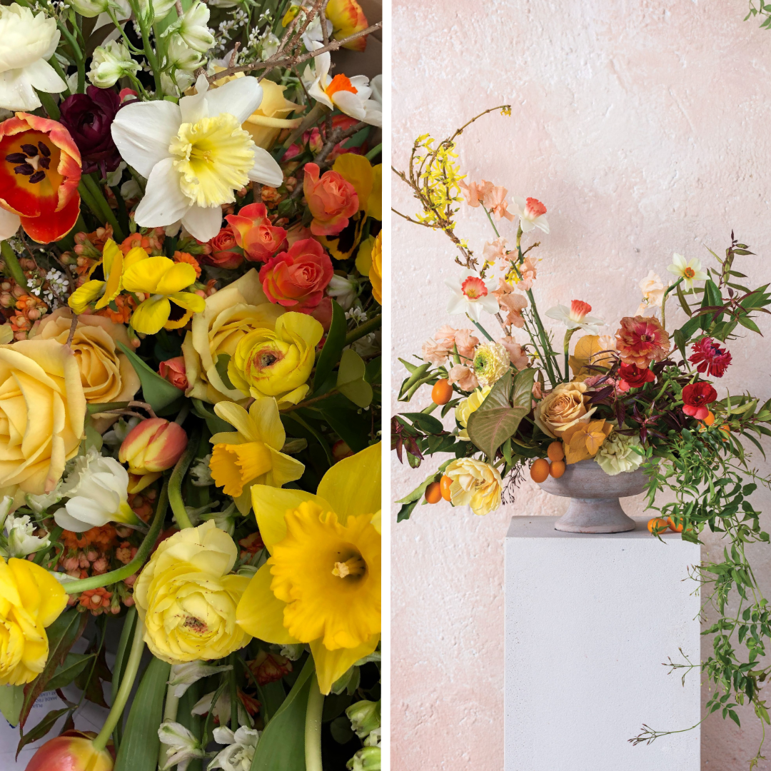
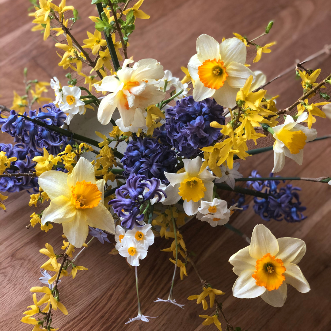
When working with monochromatic color harmonies, don’t forget that white works well!! I love pairing bright yellow with white or off-white for a more traditional spring look. Bicolor daffodils are a great way to make this seamless pairing, but traditional one-hue daffodils look phenomenal with crisp whites as well.
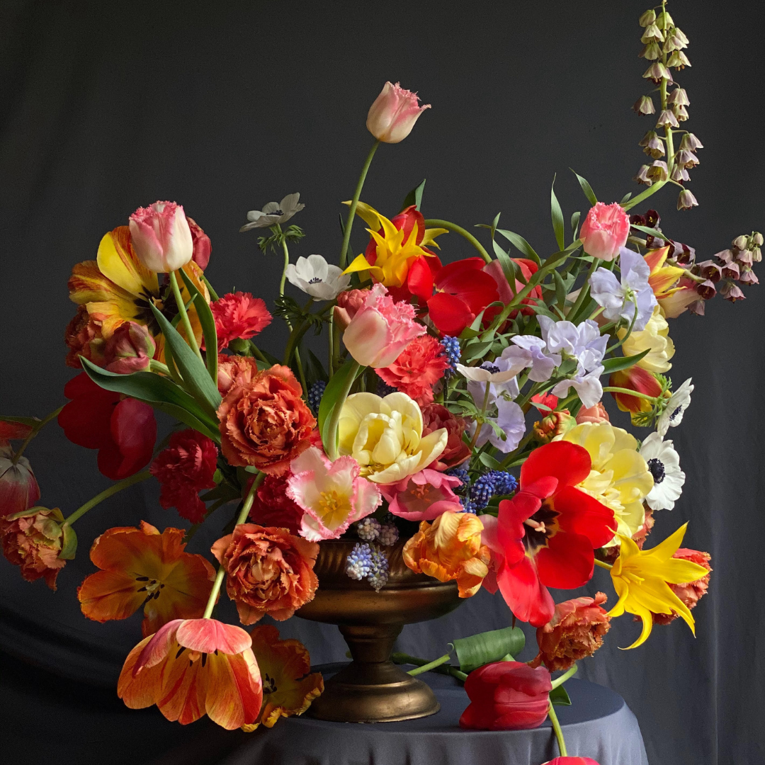
3. BALANCE THE BRIGHT
When using a bold and vibrant hue like yellow, keep in mind that it can “scream” in a palette or design. We can use that intensity to bring contrast and excitement or it can derail a design quite easily if the saturation (brightness) of that yellow is not balanced or matched with anything else in the palette or design.
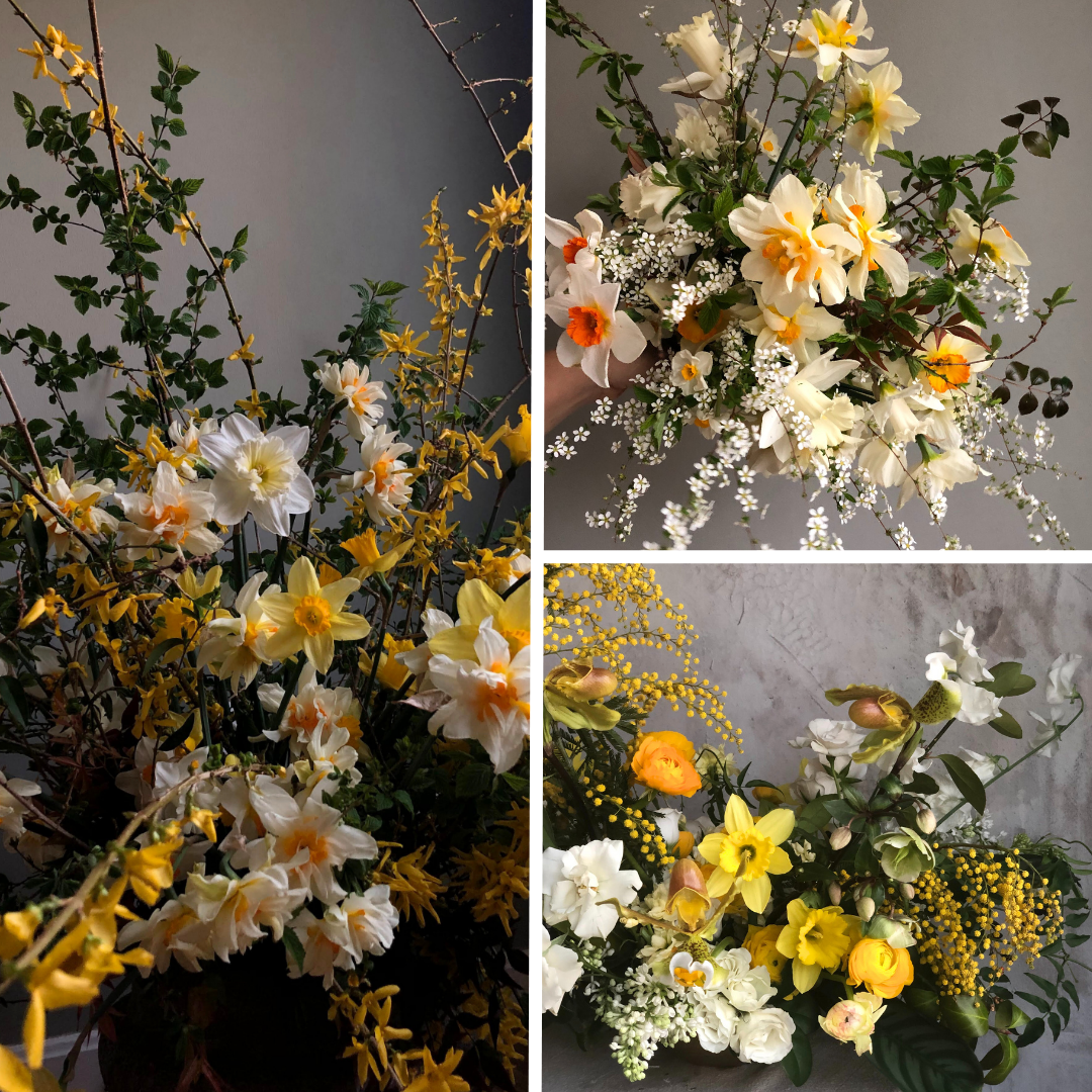
As opposed to muting or softening the yellow, you can create balance in a high contrast design by choosing another high intensity color like the violet-blue hyacinth pictured below.
These hyacinth make a striking contrast with the forsythia and the white of the daffodils act as a visual resting spot among all the vibrancy. The yellow of the daffodil centers creates repetition in the design which also adds to its balance and harmony.
The example below of forsythia and “Cafe Latte” roses and fritillaria create contrast in a more subtle way. The muddy or “tonal” quality of the rose and forsythia stems help balance the brightness of the yellow.
Don’t forget to consider the other elements like foliage, pollen, and stem color in your palette. The fresh green fritillaria stems and leaves help bridge with the vibrancy of the forsythia blooms and help visually break up the sea of yellow in the palette.

4. ADD JUST A POP
Another personal favorite way to use bright yellow is to add just a hint or a “pop” it in any given palette. It tips our hat to spring without being so “on the nose” with it. 👀An example of this below is my take on a Dutch Masters style design which typically incorporates multiple colors and flower varieties. These “kitchen-sink” style flower arrangements are a phenomenal way to use spring (or really any season’s) bounty. These polychromatic (i.e. all colors with no relationship) designs can feel a little like there’s no strategy involved, but I find that the best bet is to really commit to seasonal blooms. They go together because they grow together!
Additionally, select just a handful of bicolor blooms. Bicolor blooms can help connect colors, but if everything is bicolor, they can compete with each other.
If you steer away from yellow, I get it! It can really send a palette into strange territory but when utilizing the tried and tested principles of design and a great handle of color theory, I have found such excitement and interest in leaning into this challenging color. My advice…lean into yellow to elevate your palettes and see where it leads!
If you’re still struggling, hit the comments with any questions or check out my complete online course, Color Theory Confidence, my comprehensive guide to working with color, for any floral pro or enthusiast!

Previous Post:
Next Post:
Leave a Reply
I think you'll also love reading...


Thank you, such a lovely lesson! Visual treat, gasp, I appreciate the color lessons, very useful 💛
I’m glad you enjoyed it! I love talking about color so much. Thanks for following along! 😊
Beautiful
Thank you, friend!