


Exploring Color with Seasonal Flowers
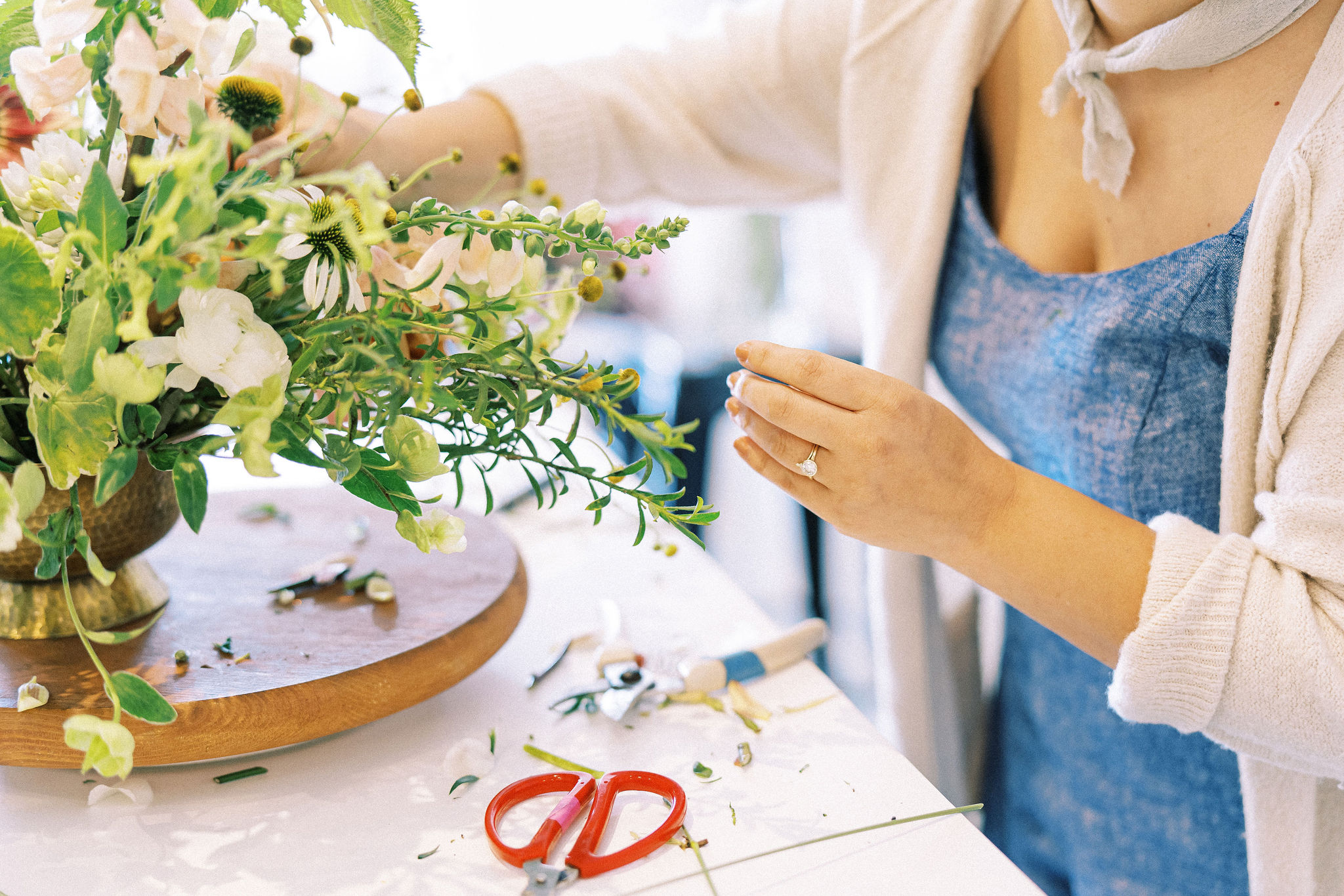
Summer always seems to arrive early but the Virginia heat and humidity brings an abundance of new summer blooms worth celebrating. Local flowers are a treasure and my go-to when in season.
But seasonal blooms can deliver unique challenges. They require flexibility with colors and varieties so this is where color theory becomes especially useful! By skillfully navigating color challenges, we can create standout palettes that use each bloom to its full potential.
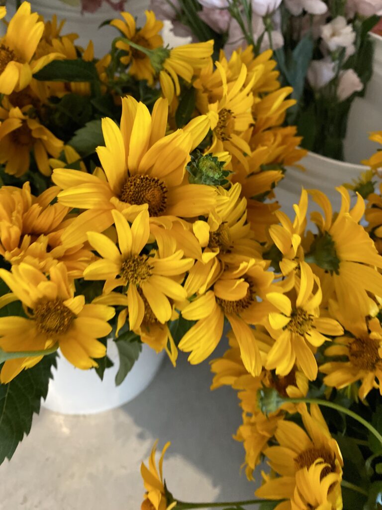
One of the challenges of some locally grown varieties is their vibrancy.. Zinnias, sunflowers, and coxcomb, for example, are most often available in bright school-bus yellows, fiery reds, hot pinks, and citrusy orange. Not a lot of subtlety there! So how do you make a sympathy arrangement or wedding design that incorporates these vibrant colors profitably and beautifully? Read on to learn my approach!
How I Build Palettes
When building a palette, I first assess the colors I have on hand and what their “core hue” is (the hue on the color wheel that best matches the color of my flower). I then look for a color harmony that makes sense for the blooms I have on hand. Identifying and understanding my “core hues” and color harmonies always points me in the direction of a successful color combination.
Once I’ve identified the “core hues” available and the color harmony I want to work with, I start to pull tints, tones, and shades of the hues within my harmony to turn-up or turn-down different design details. I might pull in more tints (pastels) and tones to add softness and earthiness for a bridal bouquet. I may reach for shades to add contrast and create an impact for a focal bloom (you can learn all about how to identify these color properties in my online color class for florists called Color Theory Confidence).
As an example, let’s use this process on the late spring perennial, baptisia. This cut flower is a two-for-one heavy-hitter, as a beautiful line flower and in interesting foliage. It can be a challenging color to work with and that’s where color theory comes in!
Assessing Our “Core Hue”
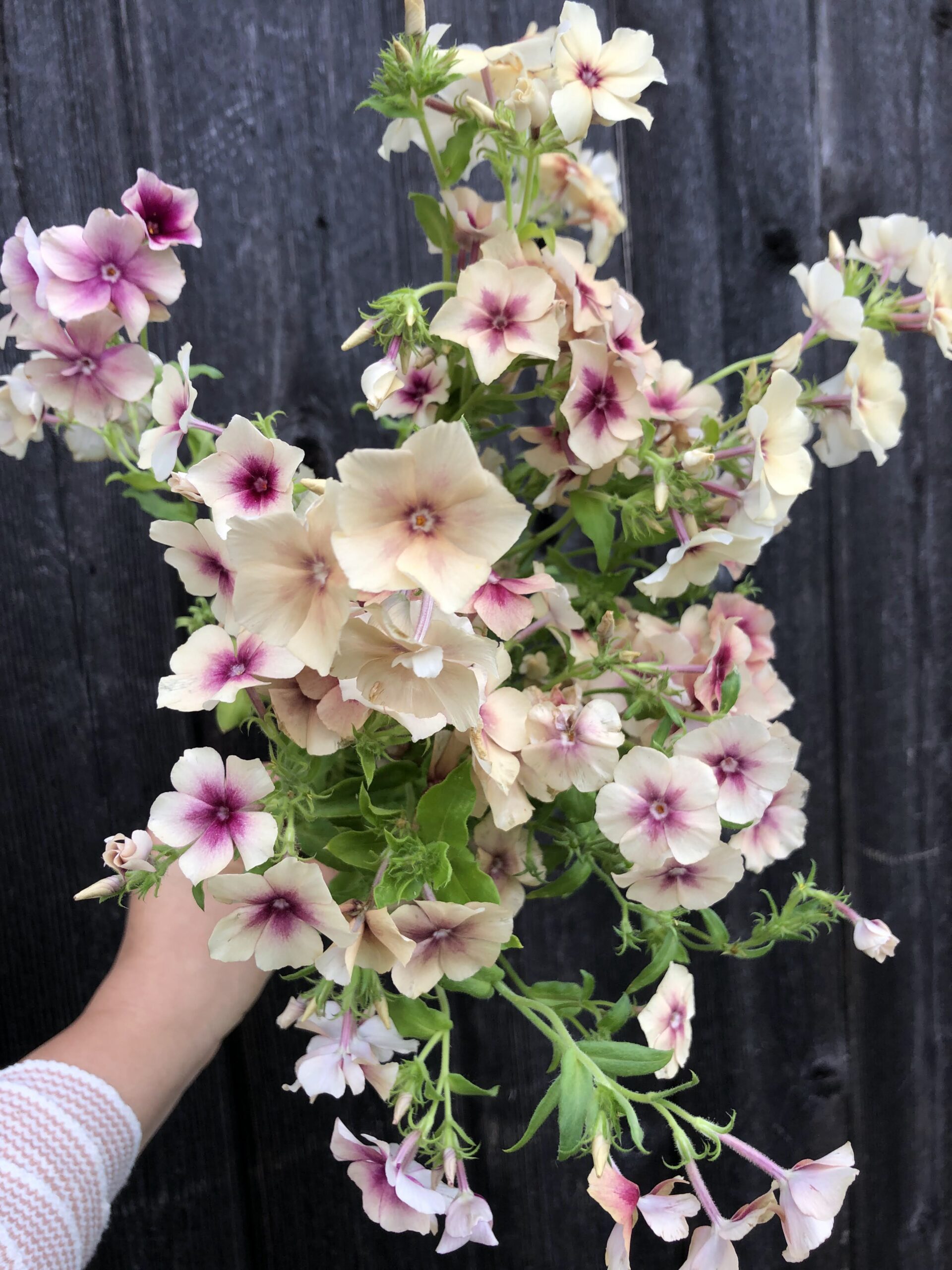
First, let’s assess the “core hue” on our color wheel. You can find baptisia varieties in many colors. There are yellow, blush, white, and even mauves.
Baptisia is best known, however, for its purple shades, earning it the name “false indigo.” Many people expect baptisia that lean blue-violet, like how a blue iris is actually more “purple”. However, you can see that the variety pictured is actually a fairly true violet bloom.
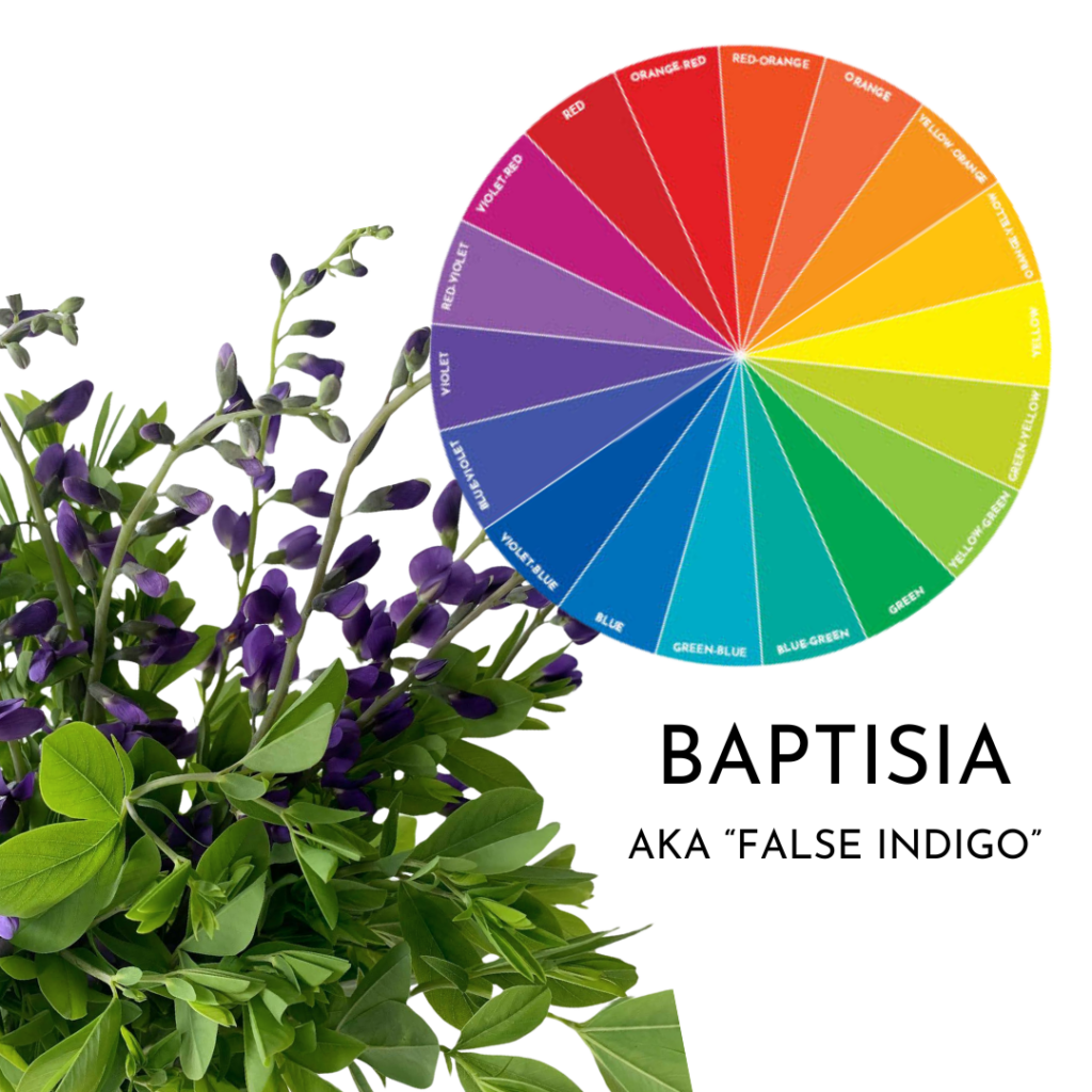
This is so common in floral design and can be a real frustration or complication for your palette. Your hot pink orchids can lean more fuchsia than magenta, or the “peach” roses your rep pulled for you are more yellow-orange than orange-red. This is exactly why you should take a color wheel to the wholesale house or market or ensure you are sending a color board to your reps to make sure you’re hitting the right “core hue.”
*I cover my step by step ordering process in Color Theory Confidence if you need help in this area!
For the sake of thoroughness, I’ve opted to include both violet and blue-violet as hues in our palettes, so no matter which way your baptisia is leaning, these palettes will be useful for you! But all in all, no matter which color is in front of you, using color theory can help you use it well!
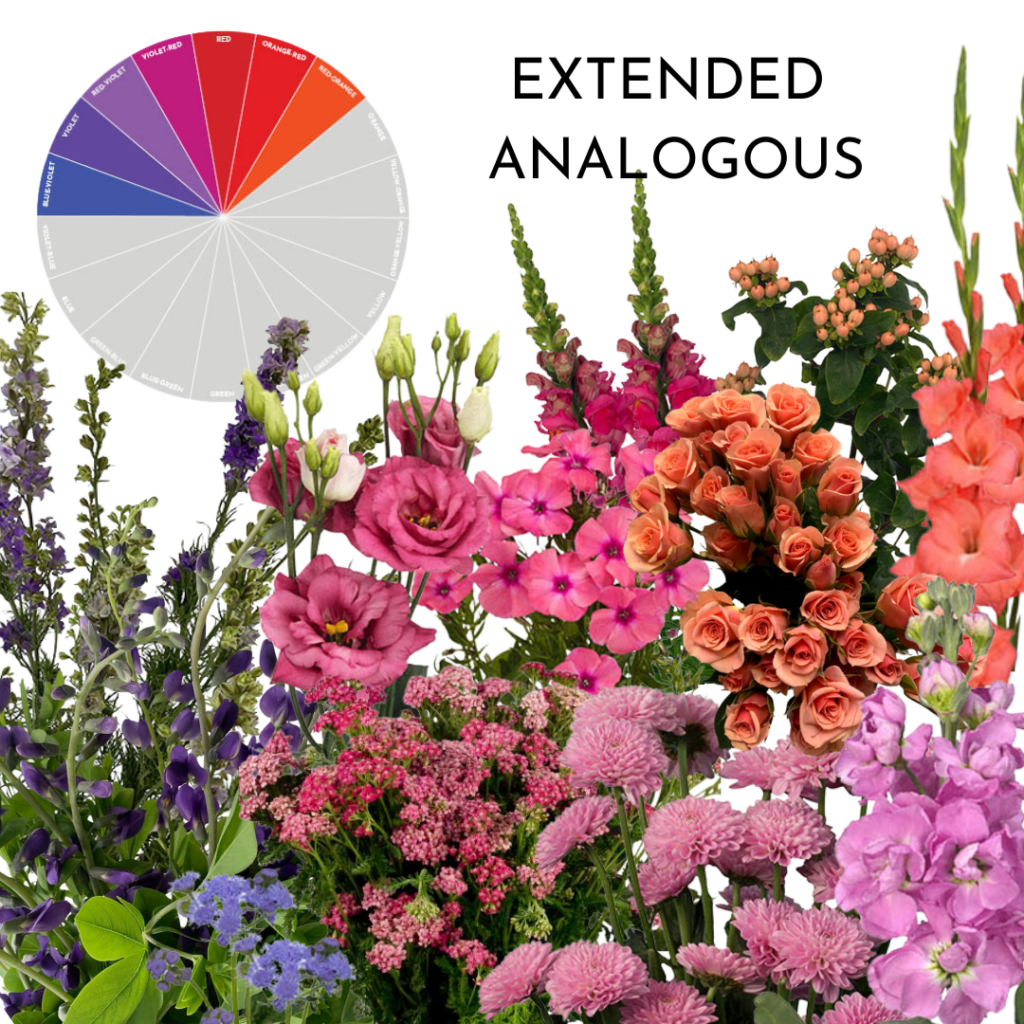
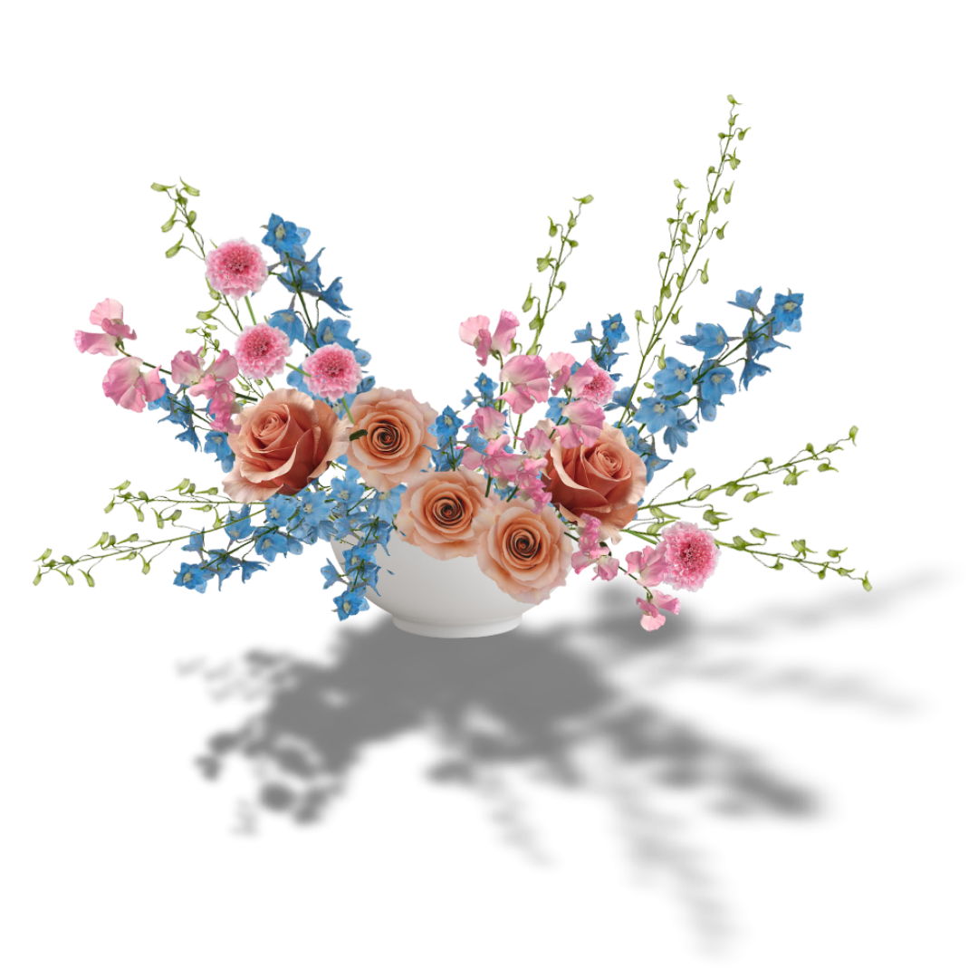
Extended Analogous
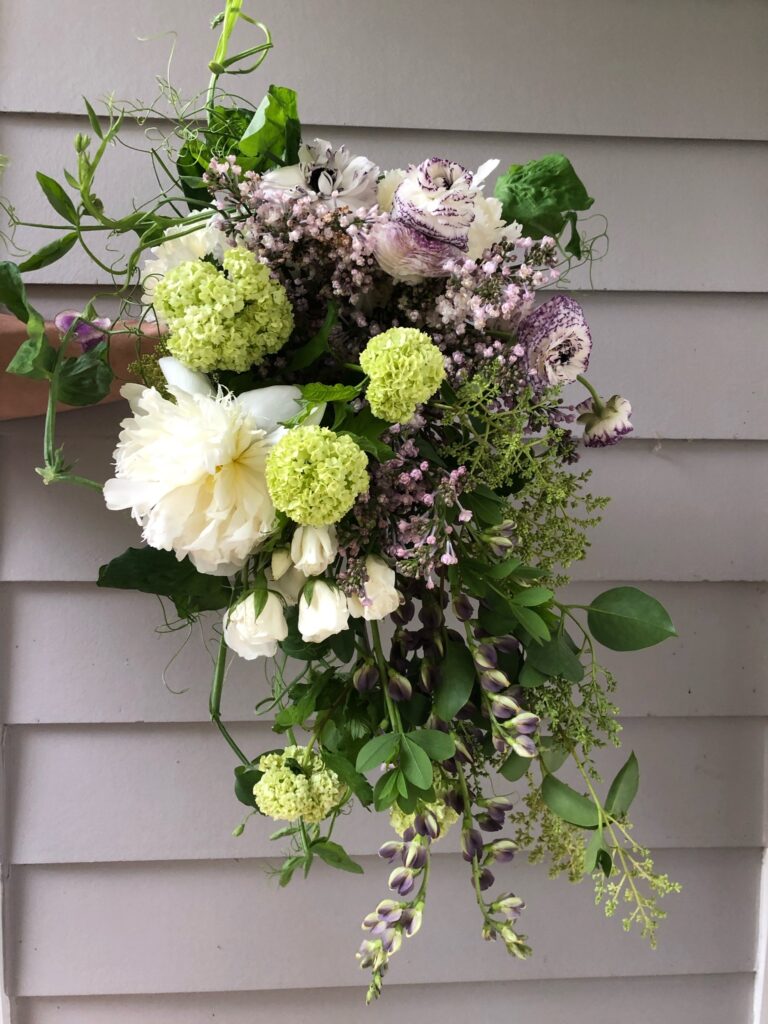
Analogous palettes are some of the most approachable out there. This one, however, is broadened (Extended Analogous) to include some warm hues. Pink and purple is a favorite combination, but the addition of the warm pink-peach and coral tones adds interest and complexity to this go-to.
Remember that as we palette-build, the colors available to us aren’t just our “core hues”, but tints, tones, and shades of those hues like (in this instance) lavender, periwinkle, smoky purple, raspberry, peach and coral.
Check out the palette below, featuring some everyday blooms and seasonal favorites.
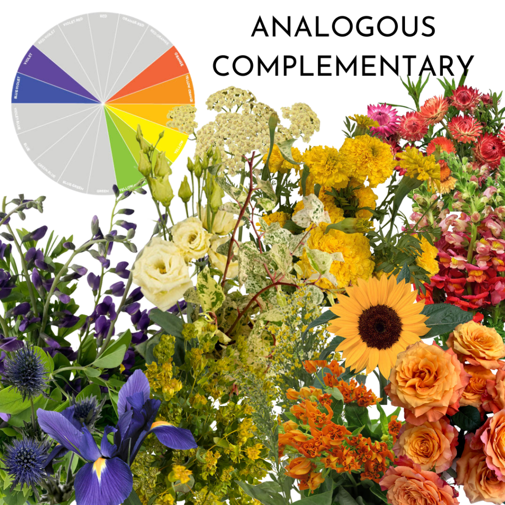
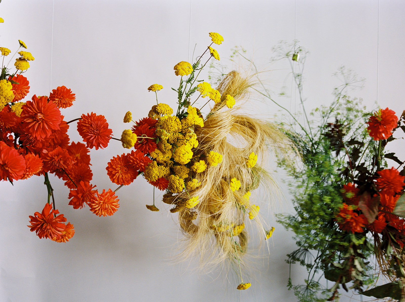
Analogous Complementary
This color harmony is a combination of two others: both analogous (similar to above) and complementary. Complementary palettes pair opposite colors on the color wheel to a striking and high-contrast effect. Analogous complementary creates a similarly compelling contrast, but with a little more subtlety.
Violet and yellow can feel like a tough combination, but the additions of green and orange make the pairing much more approachable. Tints of our “core hues” (like the butter yellow yarrow and lisianthus) add softness.
This vibrant combination works especially well in retail when the request for something cheerful or a happy mmix is requested. Or when the cooler needs a cleanout 😉 because so much goes with it. Put your fading “Orange Babe” spray roses, some slow-opening lilies, and that locally grown celosia into this broad and colorful look.
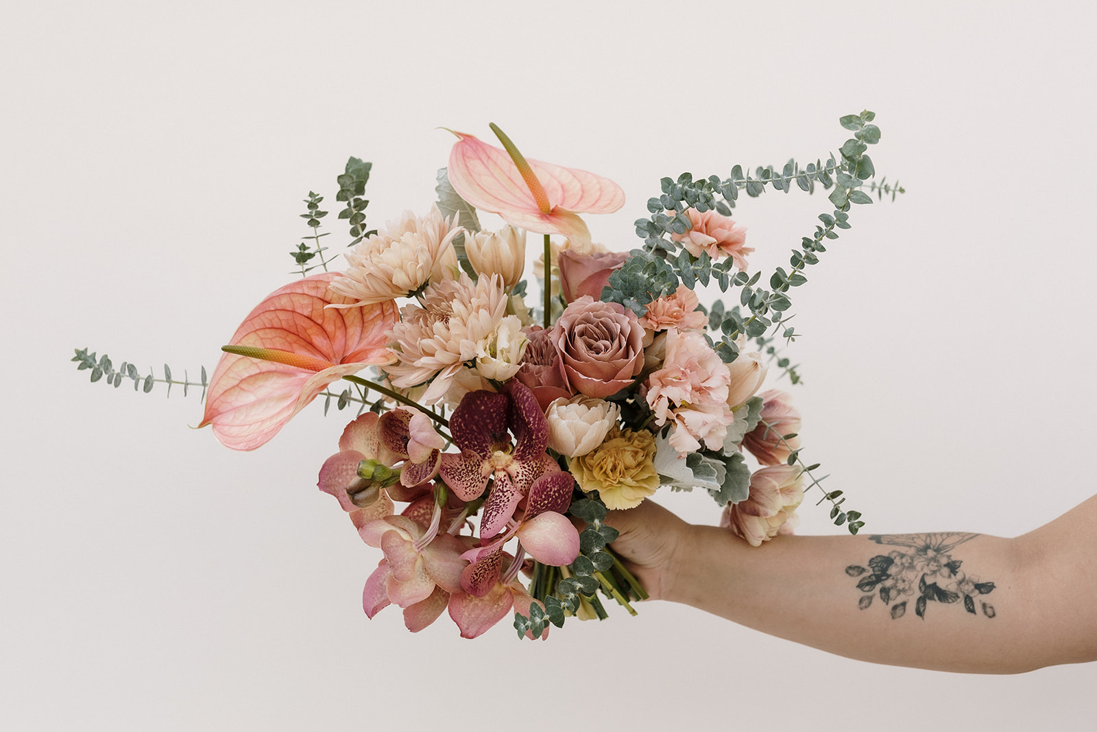
Diadic
Lastly, we’ll look at using a diadic palette. Diadic (think “di,” or two), is a palette based on one hue, and a hue that is separated by two spaces on the color wheel. Now, I like to use an 18 part color wheel because I like the detail, but it can cause complications in definitions like diadic. On a 12 part color wheel, violet and red-orange have two spaces between them. For an 18 color wheel, we have three to four spaces in between!
We’re going to play in these two color families to create one of my favorite combinations: purple and coral. This surprising combination is warm, dynamic, and rich. Although similar to the above analogous palette, the absence of red and violet-red hues results in a more contrasting, and perhaps more compelling palette.
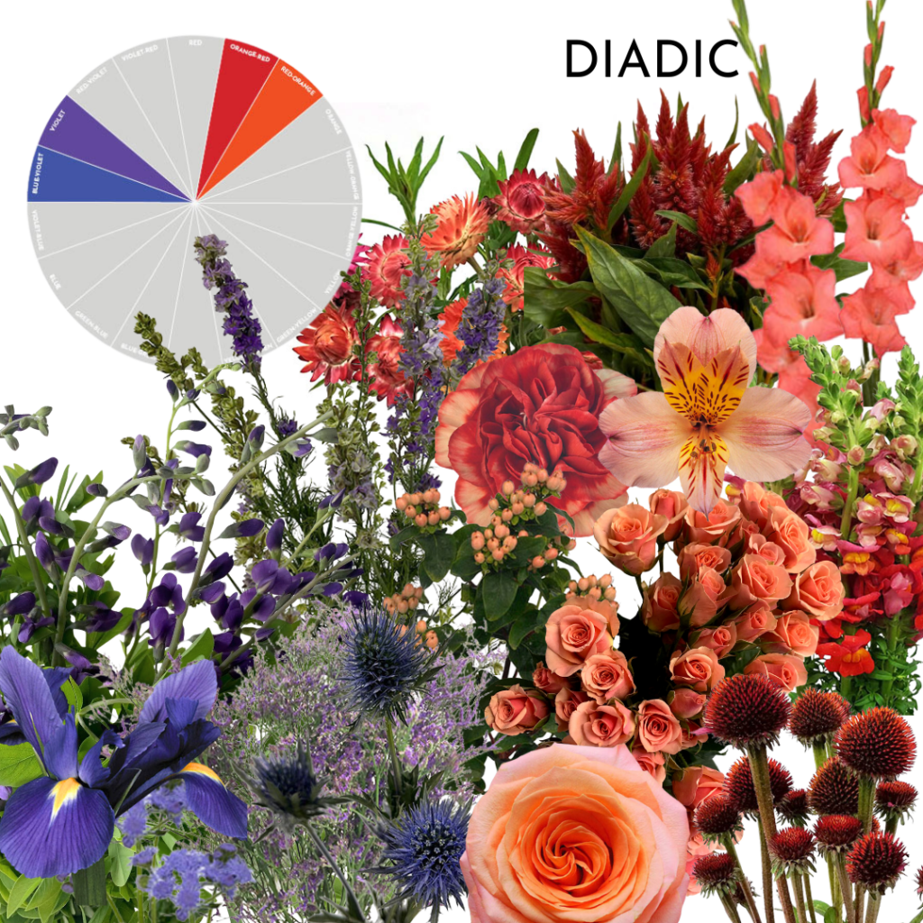
We can use these colors in varying proportions to make appropriate designs for any occasion! Make it feminine by leaning into the corals and peaches, or masculine by embracing the orangey tones. Use the pastels to create something soft, like for a baby, or amp up the vibrancy for a corporate event.
Final Thoughts
Baptisia season isn’t very long, so you might think it’s a strange bloom to use as the inspiration for three palettes, but I wanted to demonstrate that all season long, you’ll be handed ever-changing color challenges to work with. I’ve shown you what to do with baptisia, but what I hope can glean from this post is how you can use color theory and a high level look at my process to achieve interesting and successful color palettes no matter what comes across your design bench. 🙂
Color theory really makes these seasonal specialties much more approachable, and can help you make beautiful designs all summer long but I know how challenging color can be. It’s one of the most important elements we tackle as floral pro’s. So, if you want to learn more about how to build better palettes, I made a resource just for you. Color theory that works for flowers and is made by a florist, for florists, flower farmers, and floral enthusiasts of all types. It’s packed with step by step help, incredible resources, a blue flower guide, and SO much more!! It’s all here: Color Theory Confidence
Thanks for reading!
Amy

Previous Post:
Next Post:
Leave a Reply
I think you'll also love reading...


Hi Amy,
Hope you are doing well!. I work as a dialysis nurse in Ontario, Canada. My favourite hobby is gardening and I recently started as a florists and share my creations with my colleagues. I am a fan of your online course and would request if you can offer me a free course.
Regards,
Reena
Hey friend! I actually have a free webinar available at https://thefloralcoach.com/webinar Check it out and keep following along here at the blog or on my youtube for free education!
This is so interesting and I thank you for the opportunity to learn from you through this class it’s wonderful thank you.👍💓🙏
.
So thrilled you enjoyed this lesson and blog post. Thanks for your nice words, friend!