


A Romance With Red
There’s a reason red is the color of love.
As a warm color, red pops, stands out, and draws our attention. Psychologically, warm colors like red elicit our strongest feelings, from anger to happiness and can feel strong, warm, and lively.
And if you have done your share of Valentine’s Day in the floral biz, you may have strong feelings around red.
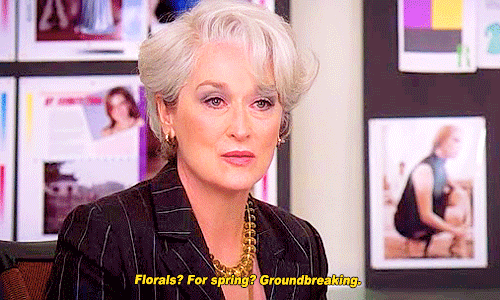
“Red? For Valentine’s Day? Groundbreaking.” 😅
So as we prepare for Valentine’s Day, how do we make this color feel like our own? How do we make red feel nuanced and special?
Well, with Color Theory, of course! A thorough understanding of Color Theory allows us to create dynamic, clever and exciting combinations of red that are a little more out of the (heart-shaped) box!
By playing with value, saturation, and temperature, we can access tints, tones, and shades in red that are visually interesting, playful, and different. We can leverage color harmonies for surprising, dynamic, and appealing color palettes that stand out from the competition.
Not sure what I mean by all that? Well, then read on! And if you are ready to jump right in and go deeper, my in-depth color theory course, Color Theory Confidence was made just for you!
From Warm to Cool, Exploring Red’s Temperature
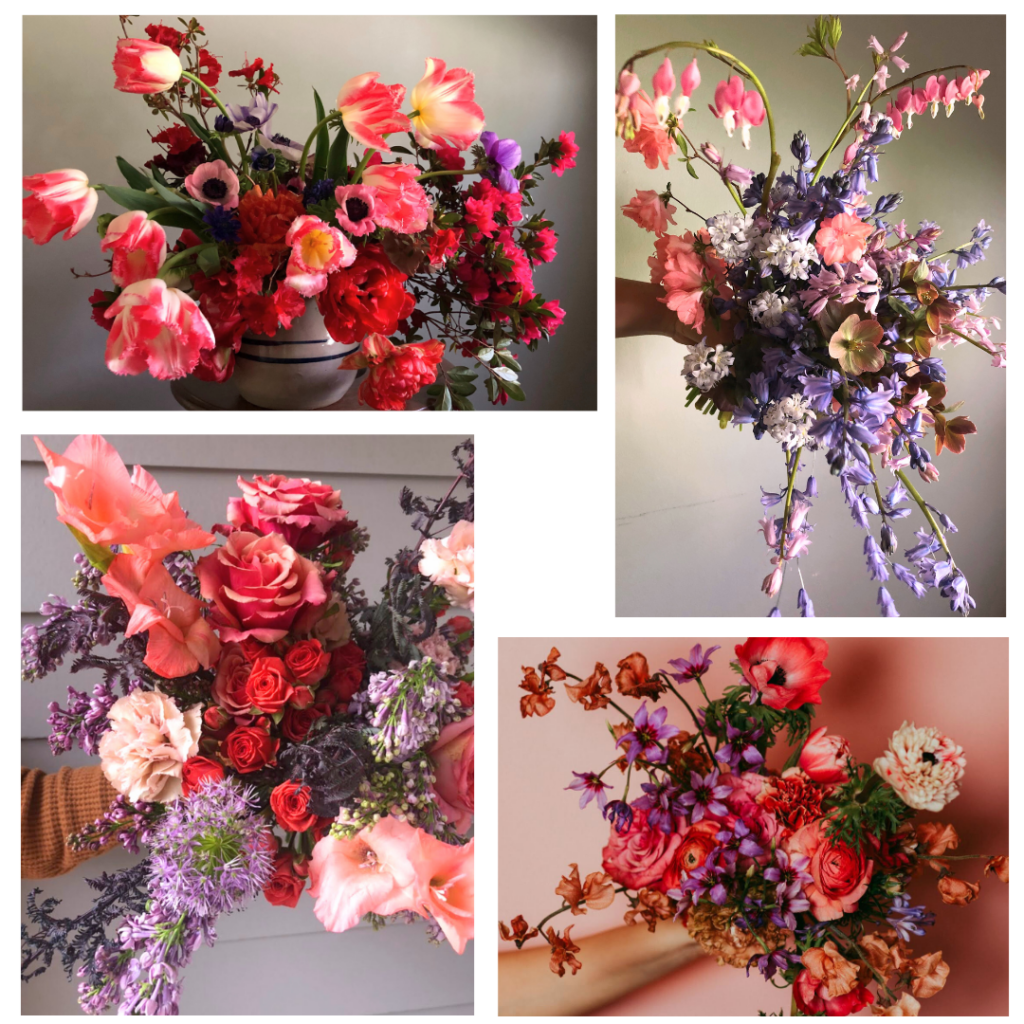
Everyone sees color a bit differently, so let’s define what red actually is. While red is a distinct hue on the color wheel, customers are often looking for blooms that may fall in the range of violet-red, red, and orange-red. See below.
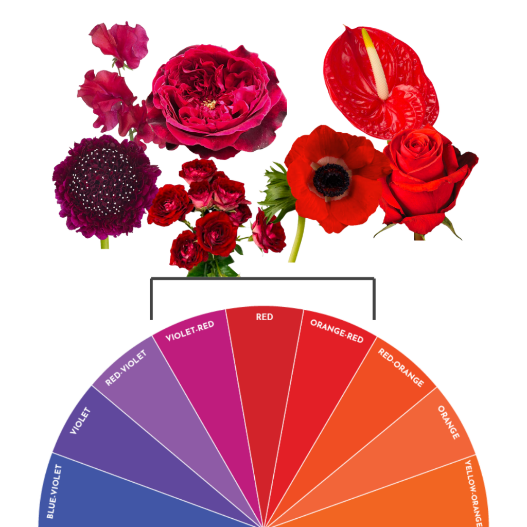
Red sweet pea, “Red Velvet” scabiosa, “Tess” garden rose, “Liberty Jewel” spray rose, red anemone, red anthurium, “Nina” rose pictured above.
Red can lean towards violet or towards orange but most customers would read any of these blooms as in the “red” family even though the temperatures are different (cooler to warmer). The true red and orange-red certainly tend to be louder and advance more visually, where the cool red (those that lean violet-red) are a bit more moody and dramatic and tend to recede more.
By playing with temperature, we can find nuance within a single color or color family. Temperature allows us to add variety, interest, and energy to our designs.
Notice the depth and interest created by combining reds of different temperatures. This applies beautifully in monochromatic arrangements or “one main color” designs.
Exploring Tint, Tone, and Shade
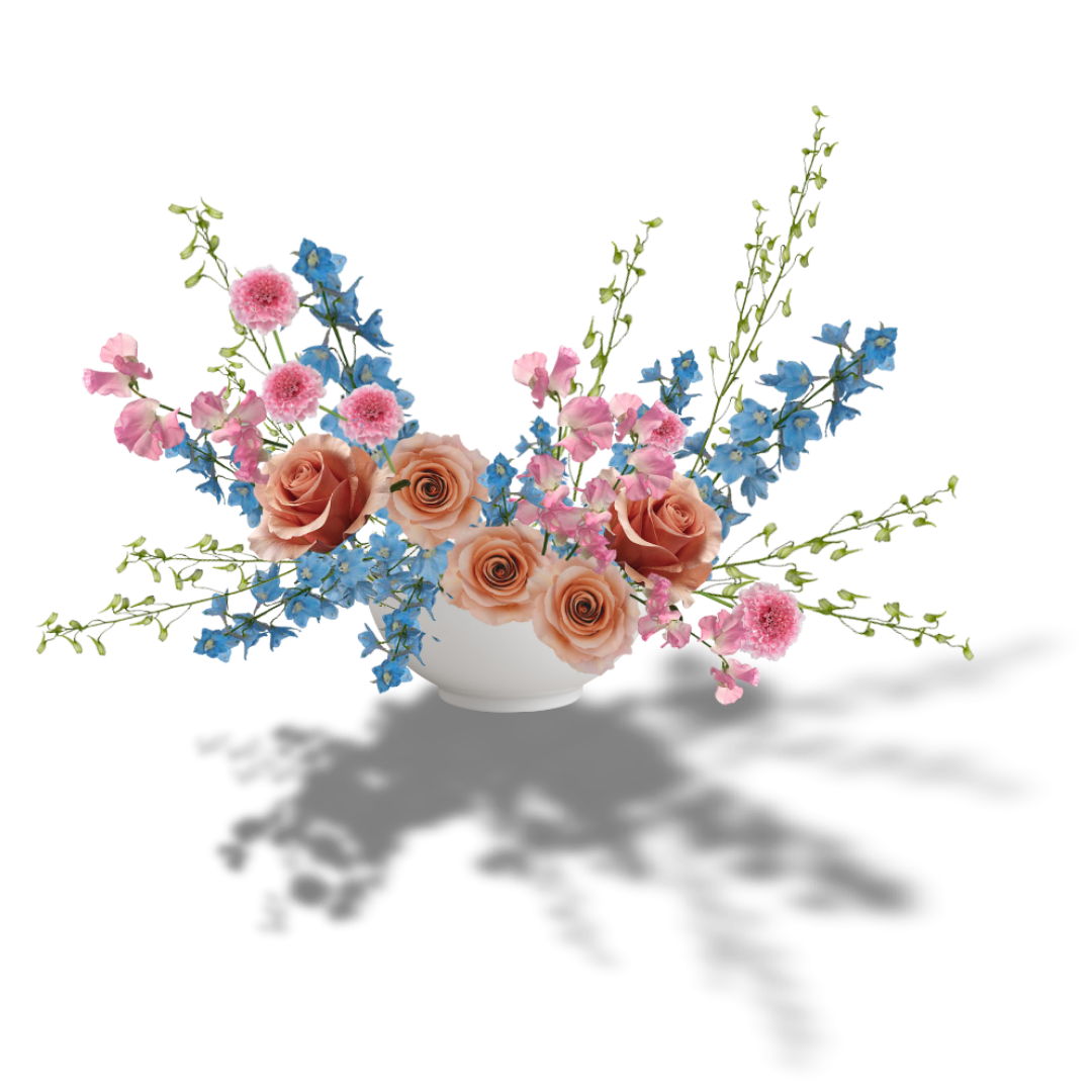
We can also make red palettes interesting by using tints, tones, and shades of red. Tints, tones, and shades are created by adding white, gray, and black to hues. That’s how we get colors like pink and burgundy! (Tints, tones, and shades are also known as different values and saturations of red.)
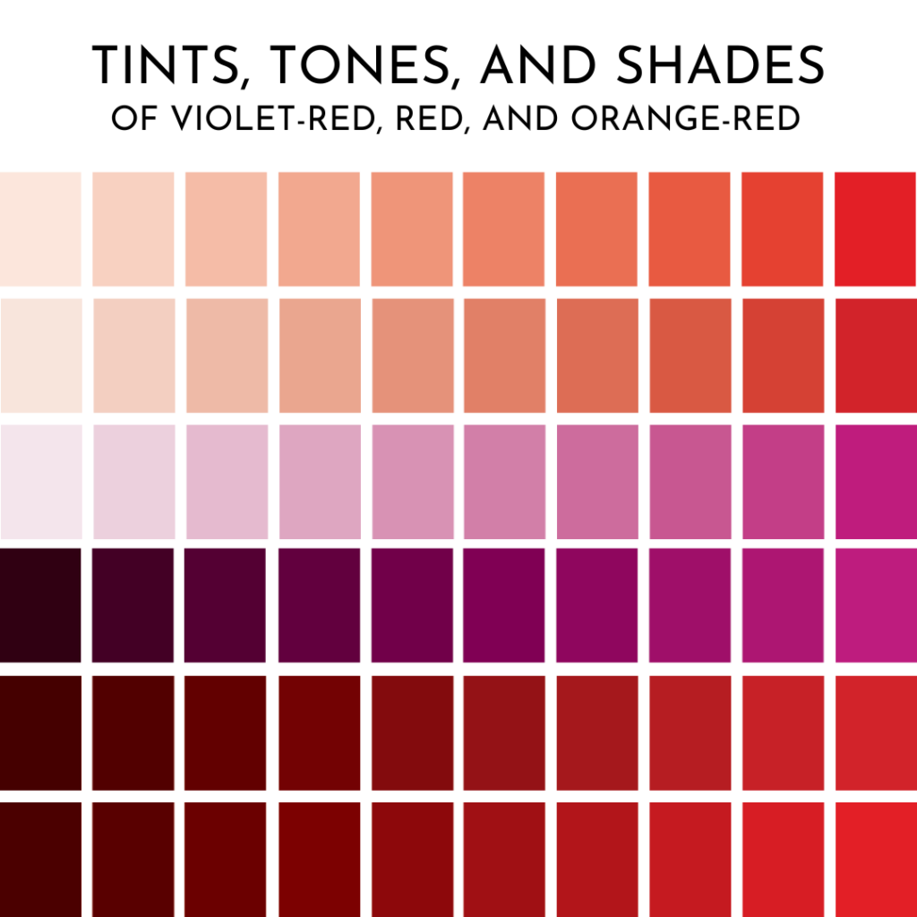
If red is a passionate embrace, pink is like a soft tug on our heartstrings. Wine, burgundy, and maroon are more sultry, like a candlelit dinner. (These are all classified as violet reds so consider them with a grain of salt. Think of reds that lean violet-red, more than pure violet-reds)
Understanding the subtlety each color evokes can help us develop palettes that are more accurate per customer. For instance, would a customer want to send moody, maroon shades of red to their BFF for Galentine’s Day? Not likely! They’d probably want to send her orange reds, corals, and sweet pinks! The versions of red that are playful and platonic, but still express love!
Pink, coral, blush??? All tints, tones, and shades of reds! But don’t they read more friendly and joyful than romantic reds?
We can stay in the “red family” and create TONS of different looks and evoke many feelings just by playing with temperature, tints, tones, and shades.
Red and Harmonies
If just temperature, value, and saturation (tints, tones, and shades) can create a lot of visual interest, imagine mixing in other colors!
My favorite way to approach mixed palettes is by picking up a color wheel and experimenting with color harmonies.
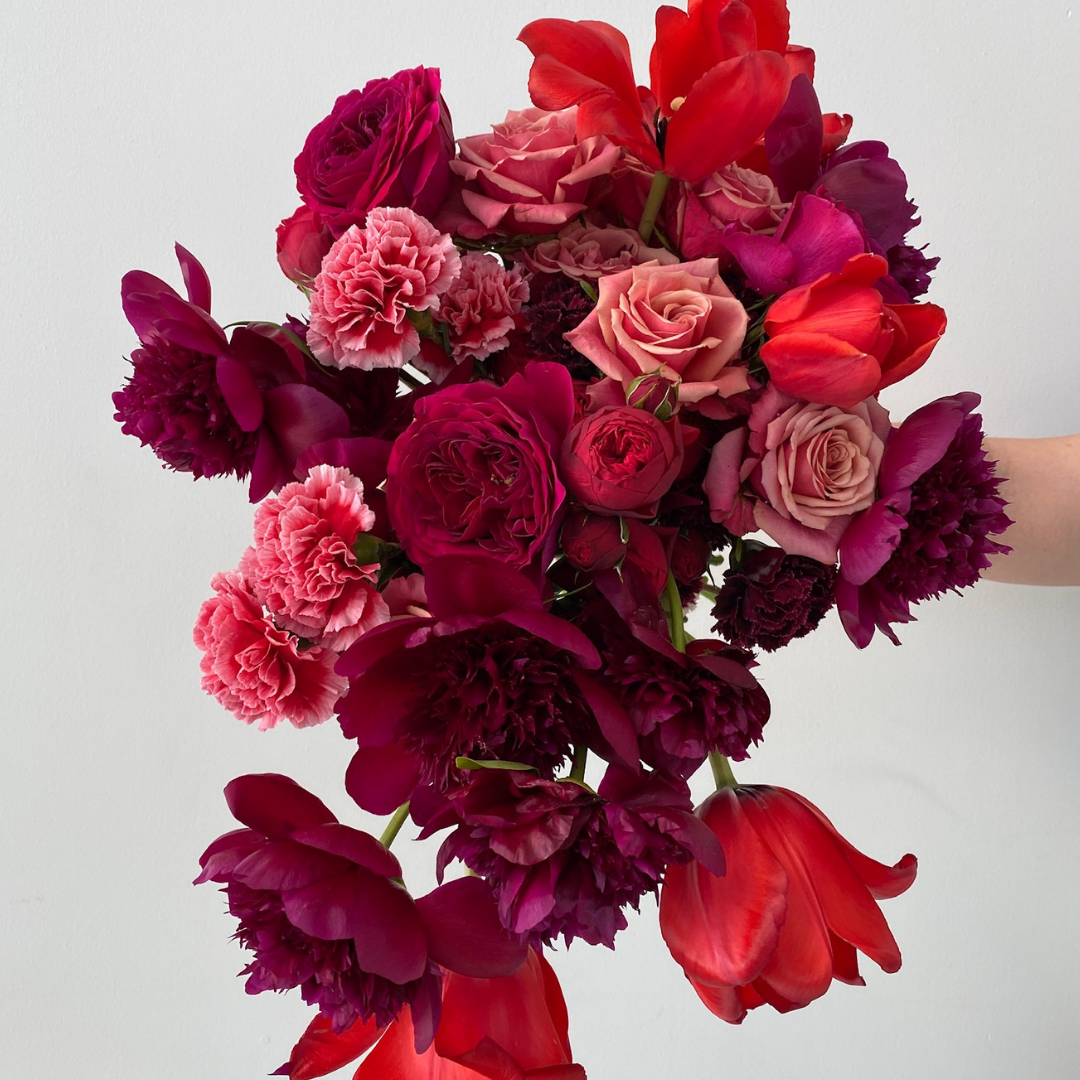
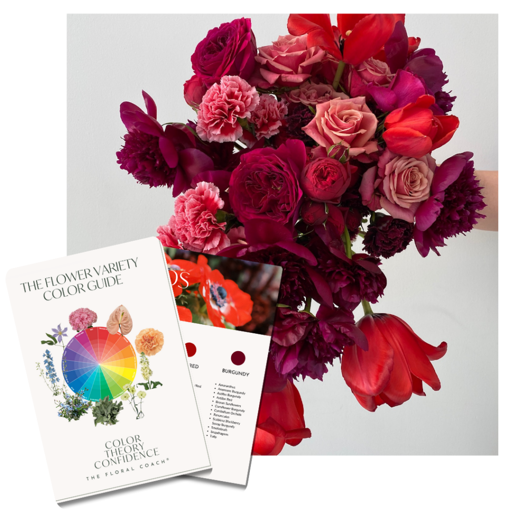
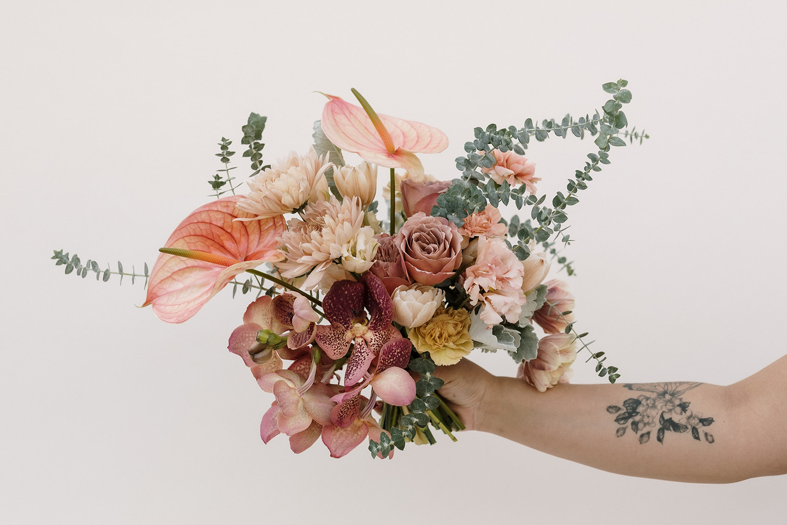
Color harmonies are utilized across all artistic mediums to create visually interesting color combinations. Some are subtle, such as monochromatic (using one color and its tints, tones, and shades). Essentially, any color that plays only with different versions of itself: like red or almost-red mixed with pink to burgundy to cherry, like the above bouquet!
Other color harmonies are more… difficult, depending on the combination; but result in invigorating and beautiful, new combinations that are attractive to customers. (I go in depth on all the different color harmonies here!!!)
For instance, you can try complementary (colors opposite on the color wheel), or diadic (colors that are two spaces apart on the color wheel) to create palettes that stick out.
Red (well, the spectrum of violet-red, red, to orange-red) paired with violet make striking, feminine, diadic color harmonies.
All in All
Understanding color harmonies and color theory can be HARD. But! Color Theory can simplify the complexity of working with color and can help you find new ways to understand what you like AND what your customers like.
If you’re struggling to mix it up this Valentine’s season, or if you just need a little inspiration thinking outside the box… then I have a little sumthin sumthin for you! Consider it an early V-day gift. 😉
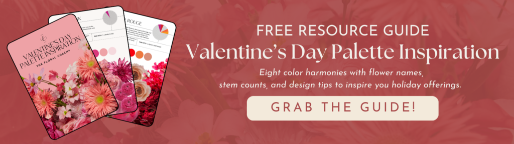
I created 8 color-filled Valentine’s Day Palette Inspiration AND Recipes! It’s totally FREE and comes with stem counts, variety names, flower photos and a design inspiration photo with design tips. You can grab it in the link above.

And if you want to learn how to create dynamic palettes that attract customers AND sound like a pro when talking color, it’s all here in my new Color Theory Confidence course!

Previous Post:
Next Post:
Leave a Reply
I think you'll also love reading...


This was super great information a great reminder that things can always be spices up via a pallet or monochromatic. I loved it and it also gave me a few ideas. Thank you for this
So glad to hear it! Did you check out my free download? It’s linked in the blog post, and there’s even more ideas in there. Happy to hear it gave you some inspiration! Thanks for following along!
I think the light pinks with a tiny pop of a red would give it so much depth.
I totally agree! That’s a very fun twist on a monochromatic red palette. Did you check out my free download? There’s one palette in there, “Sweet Valentine,” that I think you might like! Thanks for following along and your comment – Amy
Amy, love you so much. I am amazed that many younger people do not know anything about the color wheel, complimentary colors, monochromatic color schemes, etc. I like reading your blog on color theory because it refreshes what I do know, and I think that many people will benefit from the course. Thanks for sharing!
The color wheel is an invaluable resource, and color theory really levels up floral design! I’m so glad you liked the blog post, and thank you for your comment!
I appreciate your wealth of knowledge you share with me. I love it when I’m able to catch a webinar from you, not only are you a great designer, you keep my interest when you speak.
I’m blushing!!! Thank you so much for your kind words, it makes all the hard work worth it!
Thank You for sharing. I at one time knew the color wheel. I used to make decorate cakes. Now that I am a lot older I have forgotten about it. I work with flowers for therapy.
I hope this blog post helped you reconnect with some of that knowledge! Color theory is so helpful for any artistic medium. Thanks for following along and your kind comment.
hi i follow you and i really like your lesson. The more i learn bout fllower that you teach, the mire u enjoy it . Thank you for every thing .I appreciat you.
I appreciate you! There’s a lot to learn about flowers. Keep it up! – Amy
Great , information about floriculture……I got lots of new ideas …….
Thank you so much !
💜💜💜💜💜💜💜
So glad it was inspirational! Thanks for your kind words. – Amy
Thank you for sharing. I have always love to work with monochromatic palettes and I like very much the framework and way of working that you suggest.
I found it beautiful and useful.
Best,
Fabiola
With the right understanding of color theory, we can make monochromatic palettes stunning and exciting. So glad you enjoyed the blog post, and thank you for following along! – Amy
Thank you for sharing. I have always love monochromatic pallets, but I like very much the framework and way of working that you suggest, I found it very useful.
Best,
Fabiola