


How to Push Past Color Palette Paralysis – 2 Quick Tips
Does this sound familiar?
You walk into the wholesaler or scroll through an online catalog, and suddenly you’re a kid in a candy store.
Freedom roses,
Piano garden roses
Rubicon spray roses
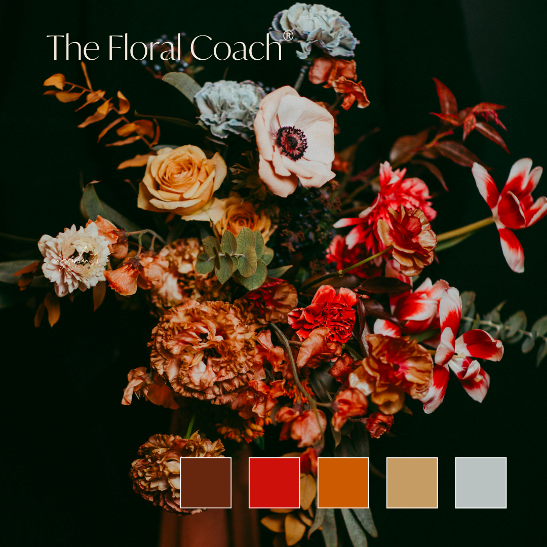
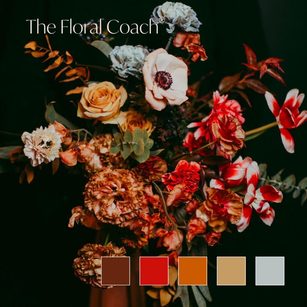
Red Mayra, Red Mikado, Black Baccara, Tess, Darcey……
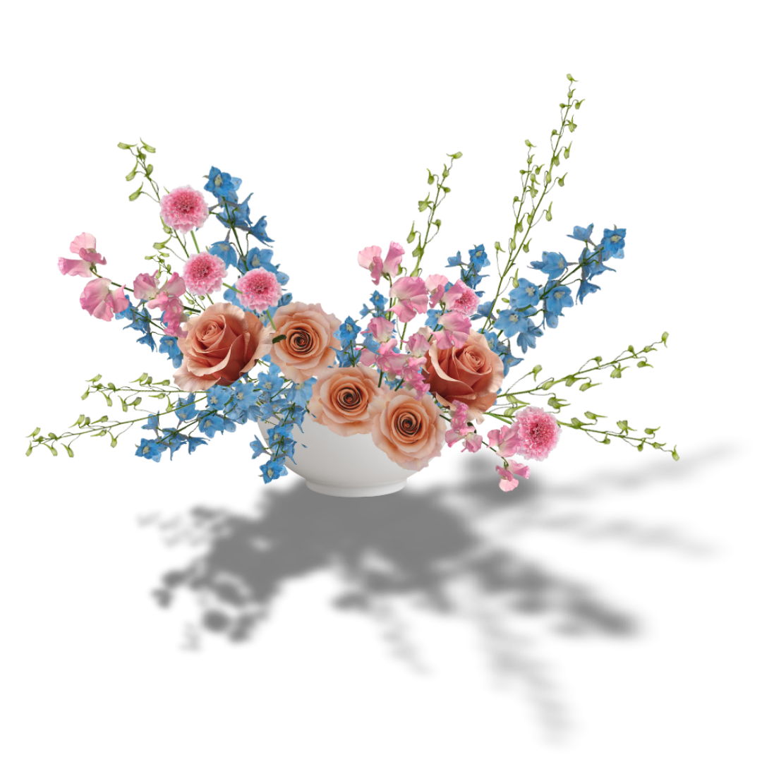
Your mind starts racing. The different variations of just red are endless.
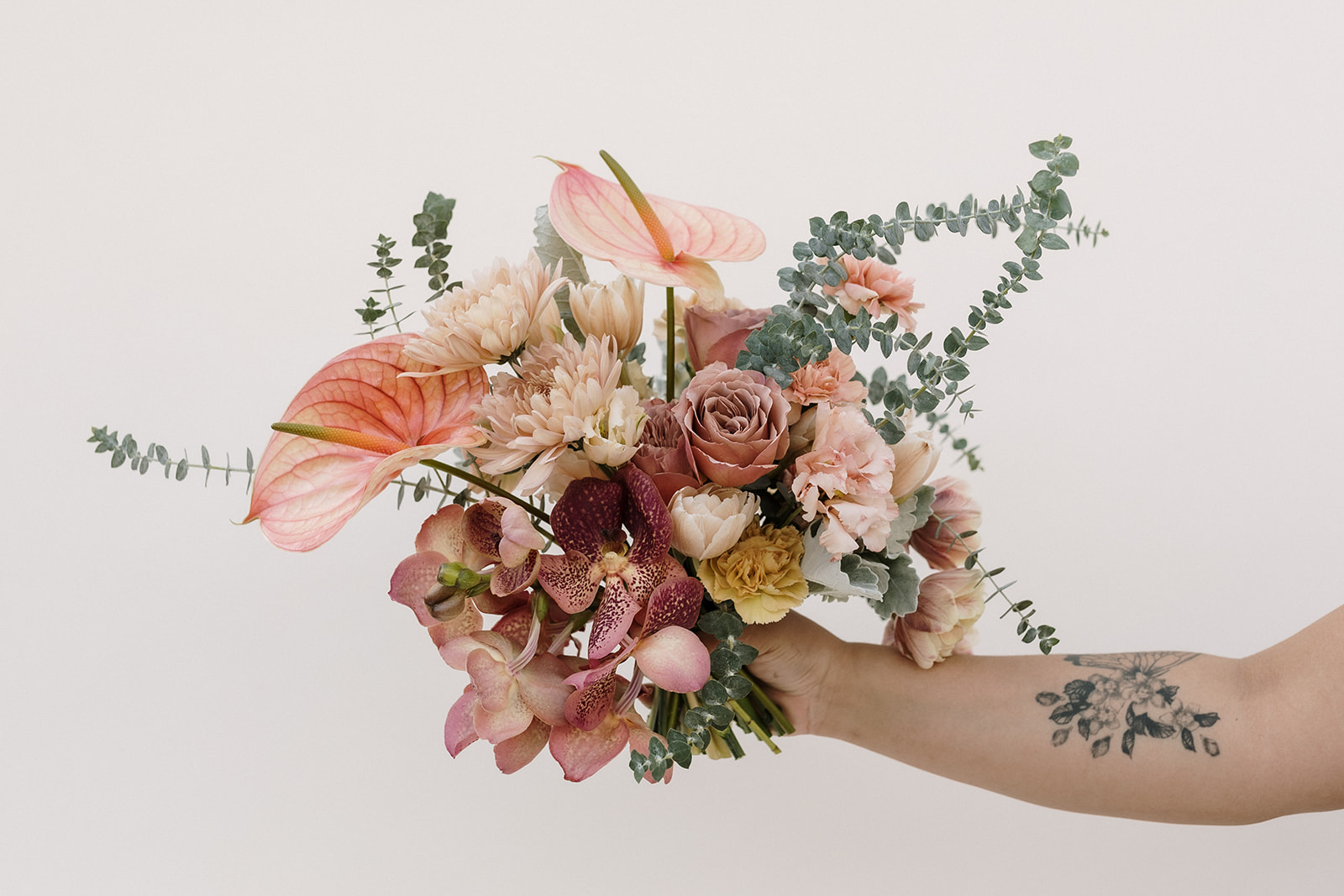
Then add in other colors: should you throw in the blush pink or go all-in with the deep burgundy dahlias? 🤷♀️
Before you know it, you’ve got a cart full of flowers in every hue imaginable. You tell yourself you’ll find a way to make it work. But deep down, you’re panicking. How does this happen every time? 🛒
I call this ‘palette paralysis’ and it isn’t just stressful; it’s a drain on your resources.
Are you nodding your head yet?
Tip #1 – Get in the Mood.
Before you even think about stepping foot in that wholesaler or adding a single stem to your online cart, create a mood board. I’m talking Pinterest, Canva, a corkboard, or even a Google Doc – something that gives you a blank canvas to pull your favorites into.
Start by pinning or pasting colors, textures, and even specific flower types that catch your eye. Then, you’ll go back in with an editorial eye and pull out anything that doesn’t work.
Some questions to ask:
- Is there a theme emerging?
- Am I following a recognized color harmony?
- Is there a dominant, hero color, or is everything competing?
- What substitutions would work if the flowers or colors you choose aren’t available?
BONUS PRO TIP: I am OBSESSED with the Mayesh Wholesale Flower Library. This is where I grab flower images from and pop them into my mood boards.
The added bonus? Show that mood board to your client. This way, you’re not just guessing what they’ll love—you’re co-creating it. Clients LOVE this.
Tip #2 – Meet Your Match.
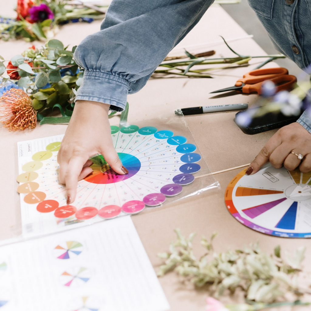
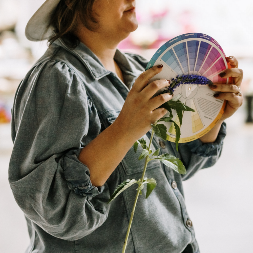
Every good detective has their go-to tools. It’s time to arm yourself with a color wheel. If you’re serious about nailing color and creating your own palettes, this tool will become your new best friend. 🎨👯♀️
Start by identifying your dominant color on the wheel. Then, use it to explore harmonious color schemes like complementary, triadic, or even split-complementary. This isn’t just art-school stuff; it’s the science of making your designs pop! 🌸💥
Once you’ve got your scheme, take it with you when you shop. Whether you’re at the wholesaler or scrolling online, having that color wheel handy will keep you laser-focused. No more second-guessing or throwing random colors into your cart.
Confused by the color wheel? Not sure how color harmonies apply to your design work? You’re not alone. I go into a full-on deep dive into how to use this to your advantage even before you have flowers in your hands in my online course, Color Theory Confidence.
Is “Winging It” with Color Costing You Time and Money?
Color, especially in floristry can feel really complicated.
I’m guessing you already have an eye for it as an artist and flower lover. But, let’s face it: relying on our gut instincts, crossing our fingers, and hoping for the best just doesn’t cut it if you’re going to thrive as a florist.
When you feel confident with color, particularly the foundations and theory, it’s a whole lot easier to get consistent results that wow your clients. And you’re never left with a pile of wasted blooms in the wrong shade of red!
Want more color theory training?
Explore my in depth Color Theory Confidence online course here!

I think you'll also love reading...