


Muted, Moody, or Bright? How to Nail Every Color Trend
Here is the reality: trends change, but foundations are constant. From retail, to freelance, to editorial work, I have relied on color theory time and time again.
So if there’s one trend that always stays the same? It’s Color Theory Confidence!

Fortunately, my friends at Florists’ Review feel the same! So when they contacted me last year about a color theory article for 2025, I was thrilled to contribute. You can check out the robust, five-page feature (I’m really proud of it!!!) but if you need a teaser, below is an excerpt of one of the highlights.
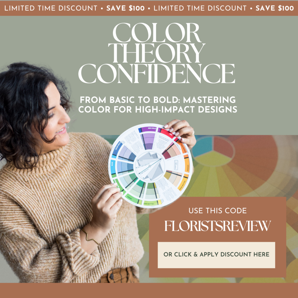
And if you’re seeking insights on color trends, adapting to changing styles, and building striking color palettes, my in-depth course Color Theory Confidence is for you! Get it right now at my best possible price, under $200.00! Or use the code FLORISTSREVIEW at checkout.
An excerpt from Florists’ Review, January 2025
Color can be understood through three main principles: hue, value and saturation. Hue and color can sometimes be used interchangeably, but while all hues are colors, not all colors are hues. Hues are, technically, pure primary, secondary and tertiary colors that have not been changed in value or saturation (we’ll dig into this in a moment). So, if you look at a red, orange or even red-orange segment on the color wheel, that is a hue.

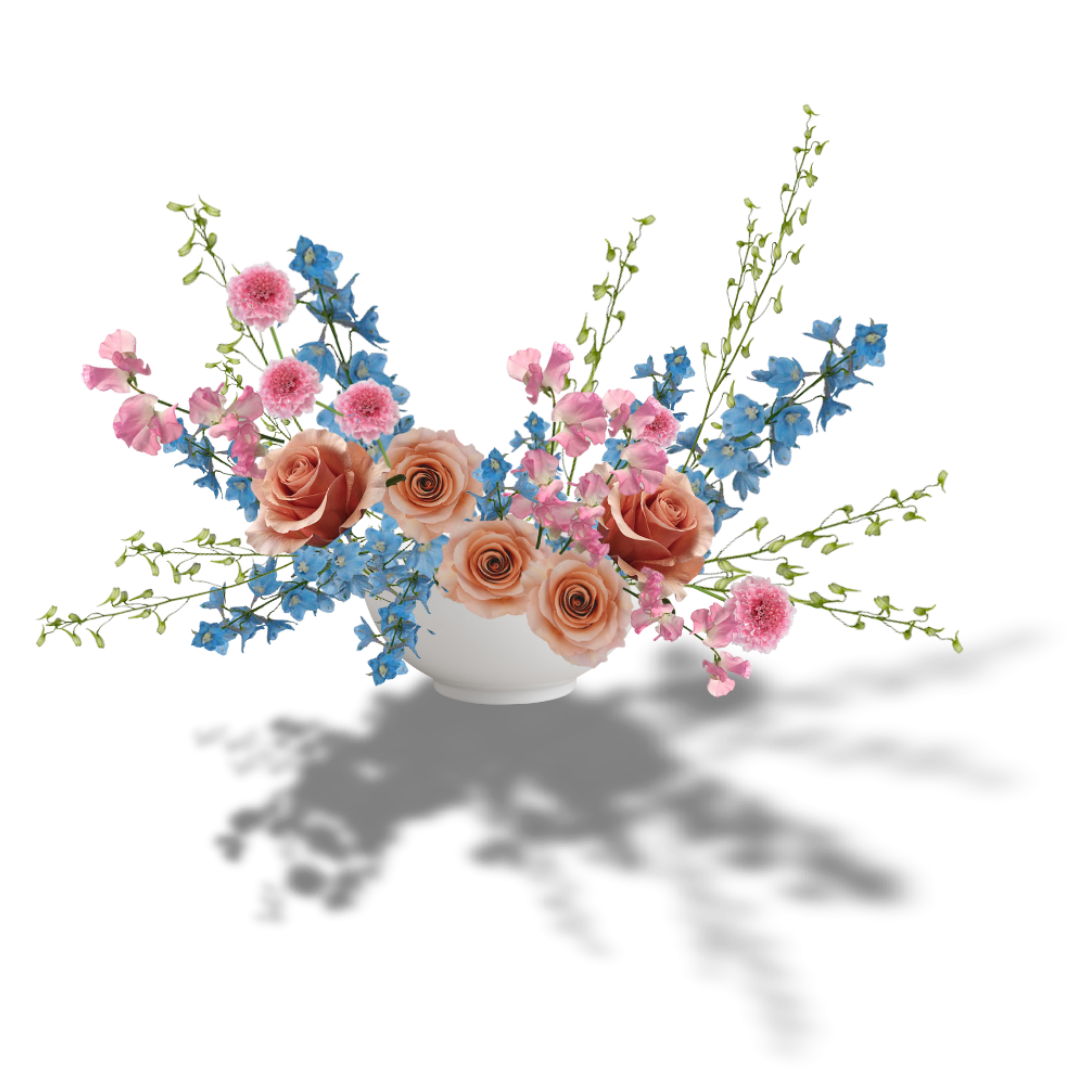
Hues violet-red, red, and orange-red are softened with the addition of tints peach, apricot, and blush and the tone rust.
All colors have a hue (I call it “core hue”) from which they are derived. Any color that deviates from those pure colors on the color wheel can still be traced back to a “core hue.”
The deviations can be understood as value and saturation.
Value is the lightness or darkness of a color, expressed by the addition of white (tint) or black (shade) to a color. Take the color red, for example. Add white, and you get pink. Add black, and you get burgundy. The color pink is a tint of the hue red, and the color burgundy is a shade of the hue red. Common tints are like pastels: peach, butter yellow, baby blue, sage green, lavender, etc. Common shades are like jewel tones: eggplant, maroon, gold, hunter green, navy blue, plum, etc.
Around the color wheel, you can apply this process.

Red + white = the color pink (a tint). Red + black = the color burgundy (a shade). Similarly, blue-green + white = the color robin’s egg, blue-green + black = the color jade.

Coral, peach and dusty pink are tints, tones and shades of the hues violet-red, red and orange-red. Together, they create a soft and beautiful blended palette.
Saturation refers to the intensity of a color. The hues on the color wheel have pure, unaltered intensity. They can be understood as vivid, clear, rich, intense and/or bright.

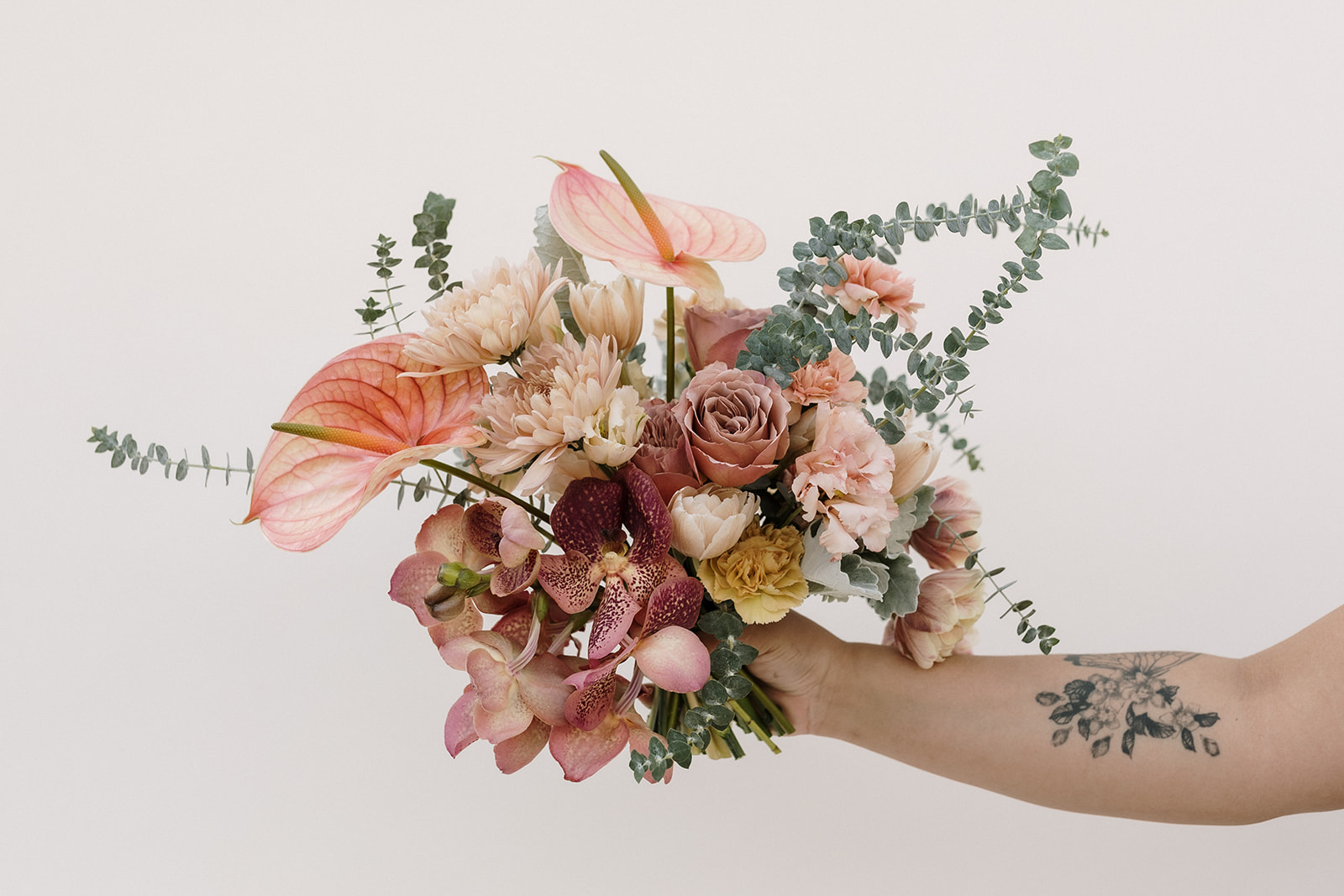
A saturated combination of the above palette. Photo:Akbar Sayed Photography
You can change the intensity of a hue by adding gray (tone). Tonal colors can be understood as earthy, muddy, vintage, muted and understated (every color that’s popular right now).

Red + gray = the color brick (a tone). Blue-green + gray = evergreen.
Saturation and value can simultaneously modify a hue, resulting in colors like dusty rose, mauve, “greige,” olive or rust, as illustrated in the following graphic.

Hues can be modified in limitless combinations with varying amounts of white, black or gray. This results in the vast gamut of what we perceive as color.
When we understand how value and saturation affect a color, we can better select the right products for our palettes. When a customer wants peach, we can analyze if their request is more a tint of orange-red or of yellow-orange. Or do they mean blush, which is really just a tint of red, after all? When a wholesaler says, “I have a purple cremon for you,” well, is it a true violet? Or is it a tone of red-violet that will look muddy and dull next to purple lisianthuses?
This is especially important when you determine how much of each color to choose for any given palette. Ratio and proportion tell us that it’s often best to consider a 10:30:60 ratio or the Fibonacci sequence of 3/5/8… (the Golden Ratio of approximately a 20:30:50) of any given color. But don’t just consider how much of the “core hue” is contained in any palette; be sure to account for its tints, tones and shades, as well.
Also consider the saturation of the palette. If all the flowers being used are pale and muted, you may need to add a bright saturated color to the palette for a much needed contrast, and vice versa.

Even polychromatic flower arrangements benefit from such ratios. Notice, there is the highest proportion of the red/orange-red family, even in the pink tints. The tint of the pale sweet pea adds visual interest and softness to an otherwise loud palette.
These principles can also guide your stem placement when arranging. Vibrant, pure hues tend to pop in arrangements. The darkness of tones and shades can recede in designs, creating depth. Tints aid transitions from one vibrant hue to another, softening otherwise loud, contrasting combinations.
Want to see more color theory in action?
Check out these free resources I’ve shared on the topic, and watch my free Color Theory webinar! And don’t forget to take advantage of that special, discounted offer!
Webinar: Build Better Color Palettes: Smarter Color Choices for More Impactful Designs
A Free Color Guide to the Cafe Latte Rose
Color of the Year: Pantone’s Viva Magenta
Hello, Yellow: How to Elevate Floral Palettes with the Power of Yellow
Exploring Color with Seasonal Flowers
Unique Color Palettes for Fall
Mornings with Mayesh: Valentine’s Day Color Theory with Amy Balsters

Previous Post:
Next Post:
I think you'll also love reading...