Unique Color Palettes for Fall
Between thriving, surviving, and embracing hibernation, fall flora is a cluster of color and tones. It’s also a thrilling and fulfilling time to design. There’s so much uniqueness to work with!
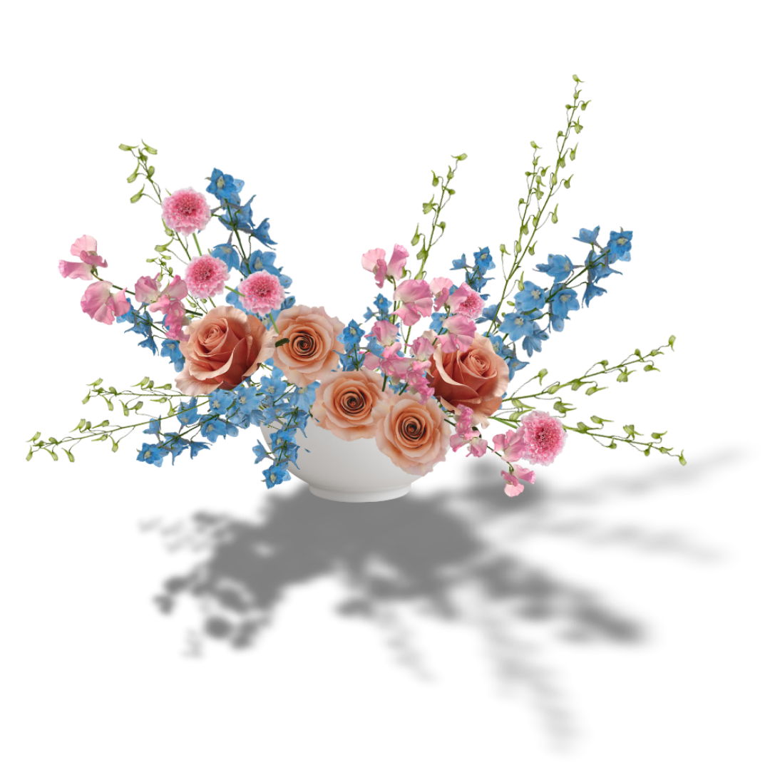
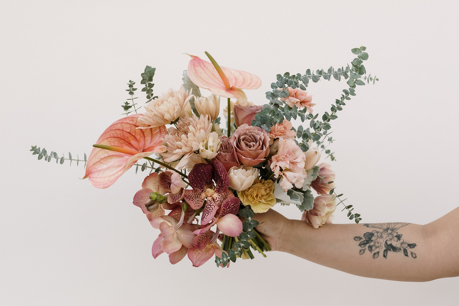
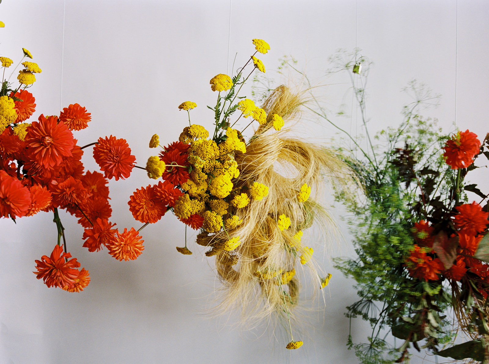
In the mix of fall, embracing color harmonies can be an inspiring path to build compelling palettes outside of the traditional, red, yellow and orange combos. This blog post highlights some examples of complementary, double complementary, and analogous complementary color harmonies that embrace fall’s unique blends.
Don’t forget to leverage tints, tones, and shades to your advantage.
- Tints = a hue plus white
- Tones = a hue plus gray
- Shades = a hue plus black
And great news, I have a totally free online webinar to help you learn how I build inspiring color palettes with some helpful tips and techniques.
Previous Post:
Next Post:
I think you'll also love reading...


